CSS3 Image Filter

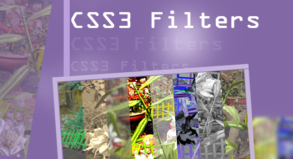
CSS3 comes with image filters like contrast, brightness, blur, saturate, Blur,hue-rotate,Sepia, Brightness, Contrast, Invert, Saturation, Greyscale and a few more. Which allows using a single image for multiple purposed that different images or apply filter in browser rather than doing it in an image editor, which definitely will have a size larger than the original one allowing faster page loads and reduced data transfer.
The Wikipedia definition for Filter is that it is a camera accessory consisting of an optical filter that can be inserted in the optical path.
Filters modify the images recorded; in earlier times they were mainly they are used for that purpose alone, other times the image would simply not be possible without them like taking a night shoot of a large area when moon light is not available can be achieved by filters.
Even in modern photography they are used to cut excess light and few other tasks as the rest are digitally changeable, even making organic moments are easily possible now.
With WEBGL Image filters are also available with CSS3, though not all the filters in image editing tools are available but the most commonly used filters like contrast, brightness, blur, saturate and a few more are presently available.
CSS3 filters work only with browsers that support WEBGL, at its only available in Chrome 18 only. Safari 6 is expected to come with WEBGL support, it won’t be long when all the browsers support WEBGL.
The Original Image is shot with Cannon EOS 7D from Thread Garden Ooty,on my tour to Ooty,A place in Tamil Nadu India. You are free to use that image.Original Image in JPEG format Thread Garden Ooty, Though i did a few editing to reduce the size.
Blur

-webkit-filter	: blur(5px);
-moz-filter	: blur(5px);
-ms-filter	: blur(5px);
-o-filter 	: blur(5px);
filter		: blur(5px);
hue-rotate

-webkit-filter	: hue-rotate(50deg);
-moz-filter	: hue-rotate(50deg);
-ms-filter	: hue-rotate(50deg);
-o-filter 	: hue-rotate(50deg);
filter		: hue-rotate(50deg);
Sepia

-webkit-filter	: sepia(100%);
-moz-filter	: sepia(100%);
-ms-filter	: sepia(100%);
-o-filter 	: sepia(100%);
filter		: sepia(100%);
Brightness

-webkit-filter	: brightness(15%);
-moz-filter	: brightness(15%);
-ms-filter	: brightness(15%);
-o-filter 	: brightness(15%);
filter		: brightness(15%);
Contrast

-webkit-filter	: contrast(400%);
-moz-filter	: contrast(400%);
-ms-filter	: contrast(400%);
-o-filter 	: contrast(400%);
filter		: contrast(400%);
Invert

-webkit-filter	: invert(100%);
-moz-filter	: invert(100%);
-ms-filter	: invert(100%);
-o-filter 	: invert(100%);
filter		: invert(100%);
Saturation

-webkit-filter	: saturate(100%);
-moz-filter	: saturate(100%);
-ms-filter	: saturate(100%);
-o-filter 	: saturate(100%);
filter		: saturate(100%);
Greyscale

-webkit-filter	: grayscale(100%);
-moz-filter	: grayscale(100%);
-ms-filter	: grayscale(100%);
-o-filter 	: grayscale(100%);
filter		: grayscale(100%);


