Complete Guide To Responsive Web Design
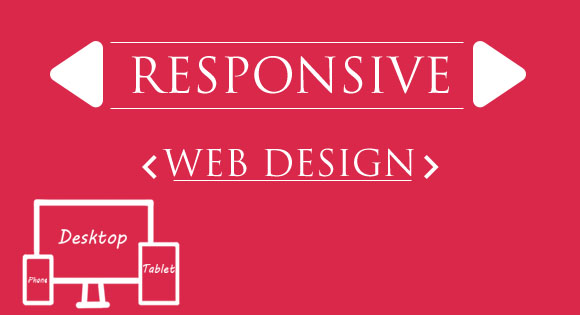
Responsive Web design is the approach that suggests the design and development should respond to the user’s behavior, responding to behavior means the website must adopt to environment based on platform & orientation and also screen size even if the user changes the size of browser or screen. It’s a practice consisting of a mix of flexible grids and layouts, images and an intelligent use of CSS media queries.
The web site must automatically switch to accommodate for resolution, image size and scripting abilities as the user switches from their laptop to tablets or change the screen size. In other words, the website should have the technology to automatically respond to the user’s preferences. This can eliminate the need for a different design and development phase for each new gadget on the market or comes in future. However this process may need additional testing with tools from a company like Inflectra to ensure your website is working properly on all browsers and devices.
Responsive web design is not a new concept it’s just the process restoring the original fluidity of the web, which we destroyed.
Emergence of Responsive Design
Almost every client these days wants a mobile version of their website build up. It’s indeed essential after all as Mobiles Brands stared moving to smart phones making the customers use Mobile phone instead of desktops or laptops, The mobile website need : one design for the BlackBerry, another for the iPhone, the iPad, net-book, and what ever any one can put in and all screen resolutions must be compatible, too. In the next few years, it’s likely that there is a need to design for a number of additional inventions. As the invention madness doesn’t seep to stop any more, it can be a problem for designers.
Why Use Responsive Web Design
Day by day, the number of devices, platforms,
and browsers that need to work with your site grows.
Responsive web design represents a fundamental shift
in how we’ll build websites for the decade to come.– Jeffrey Veen
In the field of Web design and development, we’re quickly getting to the point of being unable to keep up with the endless new resolutions and devices. For many websites, creating a new version of their website for each resolution and new device would be impossible, or impractical.
Moving mobile users to a separate sub-domains like m.yoursite.com, on which a mobile version is hosted can enhance mobile experience solved the problem for last few years, But this acted as a solution for a short time, very short indeed. But what’s next? An iPad website? Another device like iPad mini or may be a new other device? is it possible to continue commit to supporting each new user agent with its own bespoke experience.
To solve this Ethan Marcotte wrote an article on Responsive Web Design, for A List Apart. He describes the theory and practice of responsive web design in his book on this subject.
Transplant the discipline name “responsive architecture” which was a research topic in the field of architecture, Implementing that into Web design, generated a similar & new concept. Why to have a custom Web design for each group of users;as architects don’t design a building for each group size and type that uses it? (Would be funny if they did) Like responsive architecture, Web design should automatically adjust. It shouldn’t require custom-made solutions for each new category of devices of any resolution.
To implement this new discipline W3C created media queries as part of the CSS3 specification, media types, which allows us to target not only certain device classes, but to actually inspect the physical characteristics of the device rendering our work.
This marked the beginning of new methodology Responsive Web Design with the key idea of One Design, Multiple Platforms or Screens of any resolution.
What Made it a Big Thing?
Using Media queries and media query listeners it enables developers to make a single website to all kinds of devices with different screen resolutions.
Eliminate the need for Separate Mobile Web site
There has been a long-running war going on over the mobile Web:“Is there a mobile Web?” That is, is the mobile devices fundamentally different that they need a different websites for it, or is there only one Web that we access using a variety of different devices?
Responsive Web Design provided an answer for this making a single web, which increase redundancy of website.
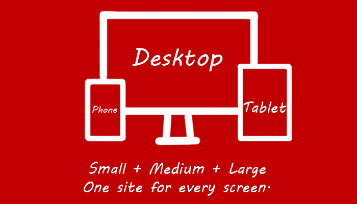
It has been noted that in the past creating different versions of a website was the way forward, however it was not the most practical solution, especially as in most cases the user would end up having to download a lot of extra code and design, alongside receiving a poor user experience.
This made it a big thing.
Few more advantages of Responsive Web Design :
- It save time and money as there is’t a need to maintain separate websites for different devices.
- Responsive Design provides every page a single and unique URL.
- Social sharing stats (Facebook Likes, Tweets, +1′s) wont be distributed ,since the mobile and desktop versions of your web pages will use a single and unique URL.
- Responsive Design doesn’t care about user agents.
Adapt Responsive Web Design
Three key technical features of responsive Web design as mentioned in Microsof Soft Developer Network are:
- Media queries and media query listeners.
- A flexible grid-based layout that uses relative sizing.
- Flexible images and media, through dynamic re-sizing or CSS.
Complete responsive Web design requires all three features to be implemented.
Media Queries
W3C created media queries as part of the CSS3 specification, improving upon the promise of media types. A media query allows to target not only certain device classes, also to inspect the physical characteristics of the device like screen resolution.Which allows developers incorporate different style sheets on the basic of screen resolution
For the purpose of making web sites responsive it can be said that the most important media feature is the min-width or max-width as preferred by the developer but make sure to use only one among them to prevent problems, this property allows us to apply specific CSS styles if the browser window (in pixels) drops below a particular width.
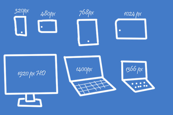
The most common pixel min-width or max-width that are targeted are the following:
- 320px
- 480px
- 600px
- 768px
- 900px
- 1024px
- 1200px
There are three ways to implement media queries: Using
- @import
- media queries directly in CSS
- Style sheet’s media attribute
Style sheet’s media attribut
< link rel="stylesheet" type="text/css" media="screen and (max-device-width: 480px)" href="style.css" /> The query contains two components: a media type (screen), and the key feature (max-device-width) to inspect the screen size whether its horizontal resolution (max-device-width) is equal to or less than mentioned one, its actually like a if else condition statement it includes the style sheet if it passes or else not.
@import
It also allows them in CSS either as part of a @media rule as shown below or @import directive @import url("shetland.css") screen and (max-device-width: 480px);
Media Queries Directly in a Style Sheet
 .class{
    /*Properties*/
  }
  @media screen and (max-device-width: 480px) {
    /*If the screen size is less than mentioned value*/
  .class{
    /*Properties*/
  }
}
Make Images Flexible
When working with images one of the key feature to be noted is to keep the proportionality of the image.There are a number of techniques to re-size images proportionately,
With img { max-width: 100%; } property in your CSS all the images will be scaled if the total size becomes less than their size.
Note that max-width is not supported in IE
Fluid grid
The key idea behind responsive design is the usage of flexible grid-based layout that uses relative sizing.The fluid grid layout is a starting point for an adaptable foundation in responsive web design, allowing sites to scale with the browser window no matter the resolution or screen size and using proportions in place of the typical fixed-width represented in pixels or percentage values applicable to most traditional web design methods. An adaptable foundation means that all the elements of a web page will render at the same relative proportions whether they are displayed full screen on a larger desktop or a smaller window. Typically, the scaled fluid grid allows websites to be adapted well to devices in either portrait or landscape orientations; however, further optimization is necessary to expand the capability beyond the desktop

When a PSD layout is converted into codes the translations are all done based on pixels, website will be view able all on devices but may not be in convenient manner. Hence a fluid grid is required, it also keeps its proportional values.
To find a proportional value of an item we use the formula:
                  target ÷ content = results
Show or Hide Content
It's possible to shrink things proportionally and rearrange elements to make it fit as a screen gets smaller. But making every piece of content available on a smaller screen as from a large screen will not be always possible.

Image credit:National Geographic РоÑÑиÑ
Best practices for mobile environments are: simpler navigation, more focused content, lists or rows instead of multiple columns.
To make the navagation simoler, the drop down menu can be converted into a simpler forum and select-option based one or a simpler one with CSS.
Hide the block in CSS with display: none;
Convert Navigation Menu into Drop Down Menu
Converting standard CSS styled menu to a small Drop down menu is the best way to ensure good navigation for mobile and small screen devices.This can makes it easier to pick a place to go than a tiny link.
You can have a different Navigation menu for small screen devices, which fits the small screens.
If you are not interested in using a drop down list you can make a standard CSS and anchor menu as US the president Barack Obama did for his website during the campaign.
Though the Navigation menu looks like a drop down menu, it's not actually .
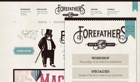
Fore Fathers Group uses a different menu for small screen devices.
- Two menus.
- Make Any one and generate other with Javascript.
To make the two menu system is a piece of Cake, Just make an Un-ordered list menu and the same one with < Select>, make the Drop down menu hidden for higher resolutions and the Un-ordered list menu for lower resolutions.
 < ul class="unordered">
    < li>< a href="/" class="active">Home< /a>
    < li>< a href="About">About< /a>
    < li>< a href="Service">Service< /a >

  < select class="dropdown">
    < option value="" selected="selected">Select
    < option value="/">Home
    < option value="About">About
    < option value="Service">Service
With the mark up ready to go, It's time to do the trick with CSS3 which can trigger the switches for both menu.
.dropdown {
  display: none;
}

@media (max-width: 960px) {
  .unordered { display: none; }
  .dropdown  { display: inline-block; }
}
It is difficult to maintain two menu, as there can be a chance that one or the other one may not be updated so it's advisable to maintain one menu and generate the other as and when required.To make the drop down menu with using javascript check the article in CSS- Trick on Convert a Menu to a Dropdown for Small Screens.
Conclusion
Concepts of Responsive Web design and the techniques discussed above are not the final solution to the changing world wide web devices. Responsive Web design still remains a concept which can improve user readability in different kinds of devices, it also doesn't seem to solve the problems with different screen resolutions for ever. This gives developers only one solution that is to work on new devices as deep as possible to improve user experience.
For Now Responsive Web design is the best for a user. With Responsive web design a website can be tailored for an old laptop or for the most advanced gadgets now and in the years to come.
With this short description and Steps to implement Responsive Design we are concluding this article here, in order to make sure that a beginner can get as much details on the Responsive web design concept and Implementation methods. Catch more on Responsive design in future article on Tech Stream, check our article 30+ Responsive Web Design Example For Inspiration.


