Re: Responsive-Design

With Responsive web approaching it’s three year anniversary, the web did start reflecting what it’s has learned within these few years. With web enabled devices proliferated, responsive design did become a part of Web Design check list for delivering usable experiences to users everywhere. Responsive design challenges us to think flexibly, incorporate our inspiration.
Poor mobile connectivity, Lower download speeds & browser support did establish difficulties in the beginning to responsive design, now these issues are almost solved with technological revolutions that happened in the mean time, with LTE, faster data connectivity and improved browser support Web designers & developers finally have the chance to push responsive design with its true power to enhance the user experience on any device.
It’s also time to rethink the concept Responsive Web design which ETHAN MARCOTTE taught us about RWD to survive in the present. Few noticeable changes with the approach are:
- Contents: The concept of “necessary contents” is fading away, and it has to. In most cases almost all the contents have equal importance, so Condensing it is not an option, hardware improvement in devices and improved browsers helped in solving the so called ” Content compression”.
- Native Like Interface: New designs are coming with truly intuitive interactions, clicks with swipes and other interactions that makes using these mega systems a piece of cake.
- Utilizing Device features : With GPS, Gyroscope, compass and other sensors Mobiles devices can provide a lot more information than the traditional Desktops, newer designs are making effective use these information.
- HTML5 it: HTML 5 did solve a lot of issues with small screen design, with the ability to deliver app like interface users, faster & easier than ever before.
These are just a few new practices that are being implemented now a days, there are many more, the sky’s the limit when it comes to specific features and tactics.
Now a days being Responsive is not a big deal, its about how good are you with it, there are cases in which Responsive design resulted in tragedy and where RWD ignited a Rocket, so being effective with the design also matters.As mobile continues its ascent in the user experience hierarchy, it’s more critical than ever to make the right choice.
Newbies to the Responsive web
Are you considering creating or improving your site’s responsive design? If so, try checking these giants who came into the Responsive web in this year, with a remarkable design by find creative solutions to the problems they faced during construction.
Mozilla Developer Network
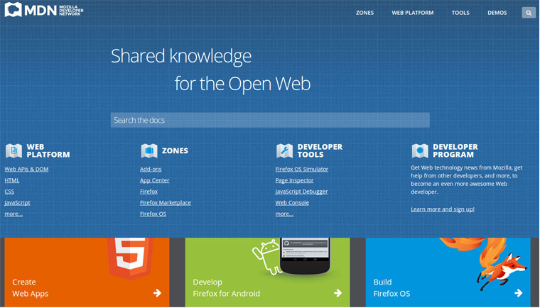
The most awaited Design for Mozilla Developer network is almost done, the new design is scheduled for launch, 9th December 2013. This definitely is one of the best redesigns that is going to happen this year.

Mozilla Developer Network Beta. The beta version new design was opened From September 2013, to user who wanted to be the a beta testers.
The discussion for the redesign did start in June this year, being a community supported organization it did kick start a lot of discussions on IRC & the mailing list. These concluded waving flag to redesign the network, being responsive was one was one among the agendas made for the redesign.
The team set out for the redesign is one of the finest available on Planet, comprising volunteers & staffs working round the clock in different time zones made this a redesign a special one. The first code for the re-design started in August, with a month the beta was ready for public.
Being part of this team as a volunteer was the best experience I had in my life.
Tech Crunch
TechCrunch, the group-edited blog about technology start-ups, launched their redesign in july. It was a completely different design, they redesigned almost every thing including the logo, layout with Responsive grids.

Tech Crunch after the redesign.
This redesign team consisted one of the finest web Geeks, See Tech Crunch Redesign Case study by Brad Frost
As usual there were a lot of comments on the resign, Reviews on Magazines and more, whatever happened they did manage to enter one among the few mega websites that has a Responsive design. The best review for the design in my views is TechCrunch Redesign by Jad Limcaco for Smashing Magazine.
Re: Responsive Design

Image credit:National Geographic Россия
The short case study of the two freshmen’s to Responsive web, clearly indicates that Responsive design is still learning to walk on its legs & need more development. Hoping the next year can bring a few more changes and new approach in design that can solve the existing and let designers & developers deliver the best experience possible.


