Design For Fingers : Touch Screen Friendly Design
Touchscreens are becoming increasingly popular. By now you should have heard of apple’s new iPad & iPad mini if not you must be living in a cave for last few months! .Right now touchscreens are mainly on smaller devices, but many laptops and desktops on the market also have touchscreen capability. Even laptops with basic touchscreen, traditional keyboard and mouse that can transform into a tablet are also available. These are not good news for a web designer who likes to ensure a good user experience for all devices available. So, you need to get your all the available cores in your brain to work to get your designs work with them.
Like converting a standard design to Responsive Design there are a lot of things to consider here too. We will have a brief look to few of the factors.
Provide room for fingers
With introduction of capacitive touch screens to Hand held devices by Apple in 2008, revolutionized the touch screens, Capacitive touch replaced stylus with finger. After Apple other manufacturer started to move to capacitive touch, which lets user use their finger. Fingers are wider that a stylus, so the spacing between the clickable items must be greater that the finger width to ensure usability.
An MIT Touch Lab study on Human Fingertips to investigate the Mechanics of Tactile Sense found that the average width of the index finger is (1.6 to 2) cm (16 to 20 mm) for most adults. This converts to 45 to 57 pixels, which is wider than what most mobile guidelines suggest. source: Smashing magazine
To reduce accidental missed taps, targets for tapping can should be larger enough. Microsoft recommends a target to be at least 7mm (about 40px) square with at least 2mm (about 10px) of padding around it.
A finger is less accurate then a mouse pointer, and, although touch screen technology is highly accurate, spacing out your links and items a little more will help users when browsing. White space always (when used effectively) Always works
No Flash ..
Photo source: fabianweber.
Flash web sites are super cool…. and easier to build than compared to other platforms. Flash websites takes a lot time to load up and is not compact-able with RWD and most importantly iPad’s don’t support Flash, Apple’s Thoughts on Flash. Instead use HTML5, which comes with a lot more than Flash.
HTML 5
Moving to HTML 5 is a massive step forwards with IE9 supporting it thus all other browsers too, with a bundle of implementable tags , make it easier to insert video , audio and many other contents.
No Hovering
Touchscreens have different design guidelines than a cursor-based interaction, and the two have different capabilities as well. Touchscreens have no capability to display CSS hovers because there is no cursor; once the user touches the screen, they click. So, don’t rely on CSS hovers for link definition; they should be considered as an additional feature only for cursor-based devices.
Consider making all behaviors click (tap) based. Hover has no effect on touch screens. If you are in need to provide secondary information using hover then you can go for touch and hold techniques.
Drop-Down Menus
The drop down menu won’t work with Touch Devices because you can’t hover over it, which is quite a major issue for many websites.Many rely on JavaScript, which is bit of a dated way to navigate now.
Alternatively, for a drop-down menu on touch devices (because you can tap-to-open some of them) is to keep a link / button to indicate that the menu expands, such as a small arrow. This is especially important if you have a mix of drop down and non-drop down links in your navigation.
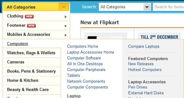
Flipkart uses hover menu with arrow to inform the touch device users about the menu.
Typography and Buttons
Typography is the backbone of web design. Good typography ensures your site readability, visually appealing and works in different user environments.
Tablets may have smaller displays than computer screens, but larger fonts work better as they are more user friendly on mobile devices.
Also make buttons finger-friendly, make buttons as large as possible to make then easier to click on a small touch devices.
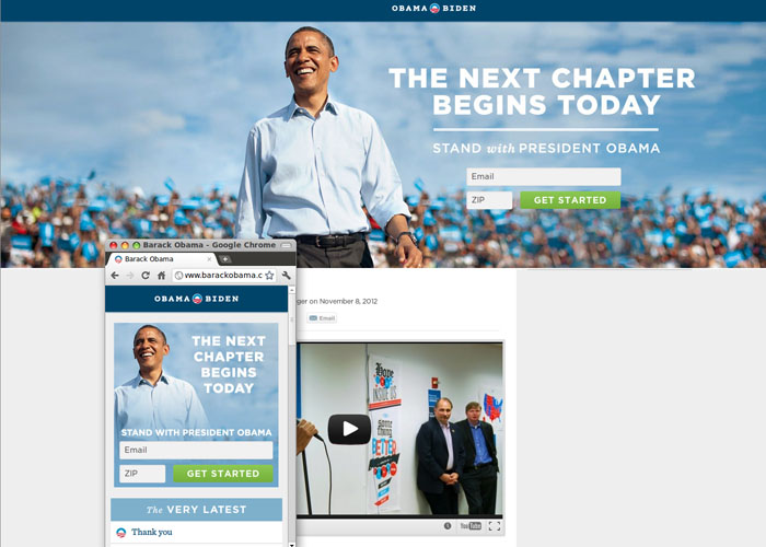
Large buttons make barackobama.com easily navigable on large & small screens.
HTML5 Forms
HTML5 come with many improvements in Forms, both for the developers &amo clients. With client side validation, Pattern matching & more it is next step forward. With support for HTML5 input controls filling forums is easier, even the verification too.
Every invention have draw backs, with identification for input types in HTML5 forms by the browser, Wrong input types will create problems as will only allow user to enter number.

Image source MSDN
Keep it simple
Limiting the user choice on your Web site, will get site loaded faster, will improve user experience on small screen. If your Web site looks too crowded on the small screen, users will likely be unable to use it properly.
Test
Once you are done tweaking have your friends look at it and make sure that they are able to use as you thought.
if you already have Responsive design then just make sure that every page works fine on tablet.


