World Wide Web At the End of 2012

As 2012 sets off and ready to welcome a new year, it’s necessary to note the changes that took place and say goodbye to some traditional practices.
Canvas less that 20 years old has undergone a lot of changes and evolution with new standards added, modified & deleted time to time. It creates new trend every year in one or the other form, in here we are set to see how those changes in 2012 shaped the Word Wide Web.
Web Page Size
Started with a 14KB in late 1995 and it hit 1MB this year in April – May. HTTP Archive reported that the average size of a single web page is now larger that 1MB , up more than 30% from last year’s average of 935KB.
The average size of a web page was
- 14KB in 1995.
- …..
- .
- …..
- 93KB in 2003.
- …..
- .
- …..
- 300KB in 2008.
- 500KB in 2009.
- 702KB in 2010.
- 935KB in 2011.
- 1MB mid 2012
Contribution of flash is far less that 40KB, the increase in average can be explained by JavaScript , CSS & images. The contributions of each to page size
- JavaScript 100KB � 250KB.
- HTML 20KB � 60KB.
- CSS 10KB � 40KB.
- Images 580KB � 800KB.
It is a clear indication of the death of Flash and emergence of HTML5. With the increase in global internet speeds and users demanding more multimedia it’s expected to cross 2MB in a short time.
These figures are extracted from HTTP archive graphical data, and rounded off to make them easily comparable.
Average size of pages on Tech Stream is 755KB.
Page Load Time
The increase in Average web page size will definitely slow down the web, The average web page takes 6 seconds to load. New Relica survey report.
The gtmetrix Survey on top 1000 websites on the internet showed that 23,000,000 GB of unnecessary data was being downloaded. This would take 600+ years for a person on a standard DSL line to complete it. Which is a large quantity of valuable time being wasted and this expected to increase by 2 � 3 folds by 2013.
Average load time for Tech Stream is 2.52s.
Mobile Traffic
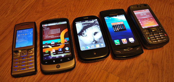
Mobile Phones contribute to 15% of total internet traffic. It showed a drastic increase from the last year, which was less that 10%.

Image Credit Carnero
This growth is a sure indication that Mobile will become most popular devices and PCs may become a second choice. To go ahead , businesses need to have a mobile friendly version of their site or make the website Responsive, if not it will result in a high loss of sales.
With a large amount of traffic from Mobile devices there is no surprise in the increase in number of online shopping via mobile, which again shows the importance of having a mobile friendly web site for your business.
Tech Stream received 14% of its traffic for 2012 from mobile devices.
Touch Devices
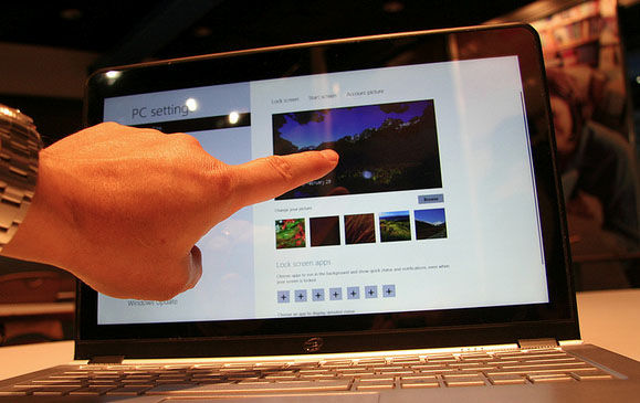
Touch Screens are becoming increasingly popular. After the introduction of capacitive touch screens to Hand held devices in 2008 by Apple, revolutionized the touch screens. Capacitive touch technology replaced the stylus with a finger, after that other manufacturer moved to capacitive screens, which lets users use their fingers. Fingers are wider that a stylus, so the spacing between the clickable items must be greater that the finger width to ensure usability.
Touch devices having a major contribution to the mobile devices, it’s clear from the above data that users with touch devices are also increasing in high amounts.
Approximately 70% of the mobile phones have a touch screen interface, touch screens will be dominating the mobile industry in a short time. Which brings in the need to optimize the website for touch screens also.

Image Credit:IntelFreePress
For further reading check our article on Touch Screen Friendly Design.
HD Screen Resolution
Every one wants multimedia in High Definition, with device manufacturers pushing towards high Resolution & high density display (Screen density refers to the number of pixels on the screen. It is generally measured in pixels per inch (PPI)). As a designer, you should consider these different screen sizes of devices when designing to prevent pictures from getting pixelated when zoomed or maximized.
Apple uses “Retina Display” for its double-density displays, it claims that the human eye can no longer distinguish individual pixels on the screen from a “natural” viewing distance.
More that 40% of our traffic in 2012 have a screen resolution of 1280 x 720 pixels or more.
HTML and CSS
HTTP Archive data show that the era of Flash videos and animations has come to an end, in 2012 the average flash content on a website is less than 40KB, with manufactures like Apple� stopping support for flash, the video giants YouTube & Vimeo moving towards HTML5 Players for video play back you might say goodbye to Flash completely in a couple of years from now.
HTML5 is better
- It’s Free.
- More Adaptive.
- Build in browser (No Add-on or Plugins required).
- iOS Supports it.
50% of the websites are now using HTML5 & CSS especially for iOS mobile devices. There is nothing that you can’t achieve with HTML5 & CSS, this practice is expected to dominate soon.
Restoring Fluidity
Increasing in mobile traffic made it necessary to have a mobile friendly site or implement a Responsive layout, 2012 saw a lot of web site coming with Responsive Layouts and older design being made into responsive layouts.
Jermy Keith said in his talk for Smashing conference (The Spirit Of The Web ), Responsive web design is not a new concept it’s just restoring the original fluidity of the web, which we destroyed. But still restoring the original fluidity became a new trend this year.
Check our article on responsive web design example to see the response in action.
Magic Number 960 vanishes
960px was identified as a magical resolution by Web Developers a few years ago, thinking that a web site of 960px wide can be seen by every in their devices. With mobile users browsing the web from devices with a variety of resolutions this became an invalid number and lead designer to go for responsive layout. With Responsive Web Design domination the web there is a decrease in the number of non flexible web site.
Browsers
Coming on the client side stuffs, Google Chrome will dominates worldwide browser market by the end of the 2012, which seems to be a good news was for designers as it give additional freedom to design. Microsoft IE 10 is expected to stabilize with its lagging in the features that it support, but it dosen’t seem have increased CSS & HTML5 Support.
Moving on to HTML5 Support Google Chrome & Firefox are in the lead by a significant margin, followed by safari , opera and IE.
55% of our visitors were using Google Chrome.
That’s all Folks !
These trends are just some of them which 2012 saw. The future is unpredictable in all ways. But it’s confirmed that Web Designers and Developers are learning much quicker than people in other fields, with tons of new semantics introduced every year it’s been a good journey till now let’s hope to see more.
Best wishes for a happy & well-designed 2013!.


