6 Hot Typography Trends

In some ways, the world of typography is a lot like the fashion industry. There are timeless looks that never go out of style, but it’s the hot newcomers that really know how to turn heads. Read on to learn about these 6 latest typography trends revolutionizing the design world.
Go Large to Improve Readability
Up-sizing your text is a great way to make an impact. Large text isn’t just for headers anymore either. A decade ago, 8-point fonts were commonly used for body type. However by 2009, 13-point body text became the most popular. It also isn’t unusual to see 16 and 18-point type creeping into websites. Large fonts are easy to read and, emphasize key phrases.
With more 45% of users preferring mobile devices for reading, it makes sense to improve readability on smaller screens. Large fonts don’t get lost on widescreen desktop monitors.
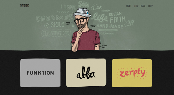
Keeping it Personal with Handmade Typefaces
Many designers are opting for handmade typefaces to set their work apart. These customized fonts are unique, and they give the work a personal, intimate feel. They also draw the eye and engage users with the content. Although these fonts won’t suit many traditional businesses, they’re ideal for grassroots operations like indie films, non-profit organizations, and small boutique stores.
Rediscovering White Space to Let Fonts Breathe
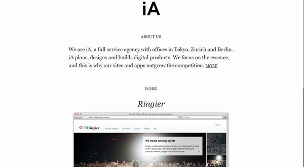
Design school drilled into us the importance of white space, yet so many designers ignored this rule after they graduated. Today, more designers are celebrating white space and giving their fonts room to breathe. White space isn’t just about returning to basic design principles. Modern designers are playing with the concept and using it to create dramatic, minimalist looks.
The trend makes a lot of sense as web started to move onto a smaller portable devices. This highly readable style won’t give you a headache, even if you’re browsing on a smart phone, netbook, or on laptops. It’s also easily scannable, so it plays into the way modern browsers consume online content.
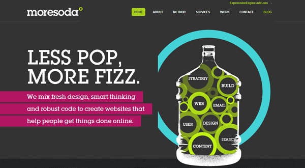
Employing Literary Style for that Retro Goodness
Books might be going digital, but their old-world charm is making a major comeback in the world of typography. This trend, which celebrates serif fonts and monochromatic colors, returns us to a time when we were thumbing through the pages of our favorite paperback rather than reading a screen.
In particular, this principle seems to fit well with urban “hipster” trends. And they appeal to the same sensibility that enjoys using vintage camera filters and wearing old-timey clothing.
Combining Artistic Type with Large Photos
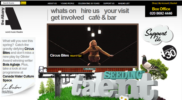
These days more designers are choosing aesthetically pleasing fonts over large images. Perhaps in this modern design landscape it’s time to rethink the old adage that a picture tells a thousand words!
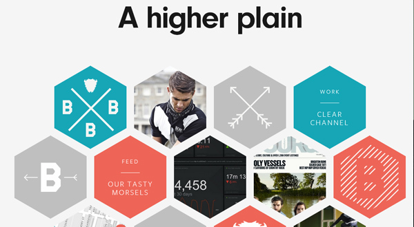
Using A Collection of Fonts in the Same Space
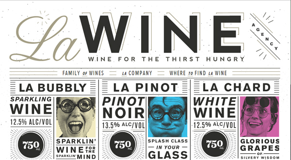
Gone are the days when a document contained just one font. Modern designers enjoy breaking the rules and using two, three, or even four typefaces on their websites. They’re also playing around with various heights, weights, and kerning.
That doesn’t mean contemporary designers have thrown out the rulebook completely though; this effect only works if the fonts complement one another. Otherwise, the look clashes and seems busy rather than appearing cutting-edge.
Whether you’re just researching the latest fonts or creating your next design masterpiece, keeping abreast of design trends such as these will only aid you in your efforts. What other trends are you seeing these days?

