What is Adaptive Web Design

With mobile traffic now accounting for around 13% (and rising) of all website visitors, It’s imperative now, to have just a desktop version of a website, and expect customers to use the desktop layout on their mobile, which can easily send them elsewhere.
Employing a mobile version or a responsive design approach is a way forward. This is often the ideal plan. But for the designs designed before media queries and smart breakouts the design teams don’t always much options to toss.
- A separate mobile version of the site. This is an invitation to additional headache.
- Redesigning the entire design with responsive design is the right choice. Adaptive designs are increasing as well.
In here we will have a quick run-through responsive web design and adaptive web design.
Responsive Web Design (RWD)
In a Responsive Design the site server the same content to all devices but it simply adapts and readjusts according to the dimensions of the device. The content remains the same but the layout changes or readjusts itself from a 3 column layout on a desktop to 1 on a small screen.
Responsive Web Design eliminated the need for servers to detect the user device and serve up whole different websites for desktops & mobile device. These mobile-optimized sites were simplified versions of the main website, usually with limited functionality to increase page speeds over a slow connection and with less multimedia content.
With apple ™ introducing tablets into the marked in 2010, there was a need for websites for screen resolutions b/w smart phones and desktops. Smartphones coming with higher resolutions make it impractical to have a device optimized version for a website.
Responsive Web Design provides the solution by re-sizing and rearranging elements on the screen to fit the user’s device. With the concept of
- Fluid Grids
- Flexible Images
- Media Queries
This is the quick and easy method that can ever be implemented. It lacks some features, namely that the user don’t get a completely optimized experience for the device, searchers behave differently when using mobile devices and since all versions are served the same content websites can take long to load on a smaller screen, damaging the overall experience.
Adaptive Web Design (AWD)
Adaptive Web Design offers all the benefits of Responsive Web Design and solves the lacks with RWD. In Adaptive Web Design content not only adapt to the screen size, it also takes into account the capabilities of the device as well.
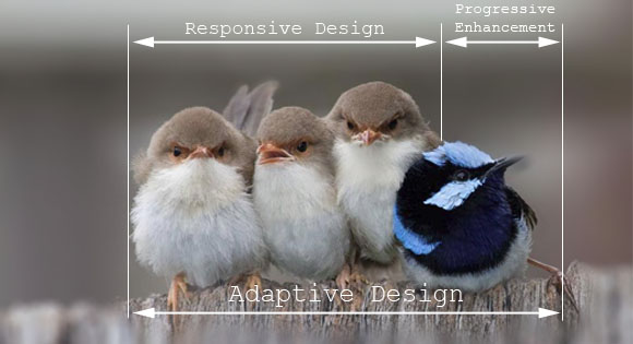
Responsive Web Design and Progressive Enhancement when combined together makes the Adaptive web. Image credit:National Geographic Россия
This offers a much better user experience as it adopts a different design for touch screen devices and a traditional mouse & keyboard arrangement. Multimedia features are completely optimized to speed up the loading times on a page.
How is Adaptive Web Design Different…
Responsive Web Design is the subset of Adaptive Web Design, AWD includes few other features that makes use of the capabilities of the users device where as RWD don’t. The extra feature in Adaptive web design is often termed as Progressive Enhancement.
Progressive enhancement is the practice of optimizing to the lowest common denominator and selectively adding functionality based on the capabilities of the device when moving up.
Adaptive VS Responsive Web Design
With all these concepts mentioned above it’s clear that you have got it, but still here is a comparison against the two new design giants Adaptive VS Responsive Web Design.
An adaptive comes in handy as you have limited states to consider. It can ensure you that the design will work in any resolution, though you cannot predict how it will look at that resolution. It’s cheaper to implement & easier to test. Adaptive design is the perfect solution for an existing website, to make it up without a complete rewrite.
It’s clear that Adaptive web design provides a totally different user experience. The perfect choice for your business depends on budget and the type of content you need to provide like shopping web site can use Geo-location to get the user location and predict the shipping cost. If you choose any of them you can be sure that you can hit the mobile world.

