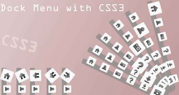
Dock Menu with CSS 3

The Following example will only work with the following browsers only.
The Dock is a prominent feature of the graphical user interface of the OS X operating system. It is used to launch applications and switch between running applications like the taskbar in windows. The Dock is also a prominent feature of OS X’s predecessor NeXTSTEP and OpenStep operating systems, and the term “dock” is sometimes used generically to refer to similar features in other OSes, such as RISC OS’s icon bar.
This dock make use of –webkit for the transition purpose, this does not need any java script or jqurey. This is a simple easy to install menu like an ordinary This dock make use of –webkit for the transition purpose, this does not need any java script or jqurey. This is a simple easy to install menu like an ordinary CSS menu.
The Mark UP
Here we have used div tags , even Unordered (
) can be of used with (
)
The CSS
The Style for positioning Dock and the common styles for the link links
#Dock{
	position:fixed;
	/*use these value to positon the Dock */
	bottom:100px;
	left:25%;				/* change it according to your convenience   */
	height:40px;
	width:670px;
	padding:0 10px;
	border-radius:6px;
	background-color: rgba(154,147,147,0.2);
	-webkit-box-shadow: 2px 2px 3px rgba(172, 172, 172, 0.4);
	-moz-box-shadow: 2px 2px 3px rgba(172, 172, 172, 0.4);
	box-shadow: 2px 2px 3px rgba(172, 172, 172, 0.4);
}
.link{
	position:relative;		/* to make the icons apper above the div Dock  */
	bottom:60px;
	width:100px;
	height:100px;
	display:block;
	float:left;
	margin:5px;
	background:#0F9;
}
This is where the magic happens , the different effects for the dock comes here
/* For rotate effect */
.rotate .link:hover{
 	background-size:100px;
	background-position:top;
    -webkit-transform: rotate(360deg);
    -moz-transform: rotate(360deg);
    transform: rotate(360deg);
	-webkit-transition:all 0.60s linear 0s;
	-moz-transition:all 0.60s linear 0s;
	-o-transition:all 0.60s linear 0s;
	-ms-transition:all 0.60s linear 0s;
	transition:all 0.60s linear 0s;
}
/* For zoom effect */
.zoom .link:hover{
 	background-size:100px;

	background-position:bottom;
	-webkit-transition:all 3s ease-in ;
	-moz-transition:all 3s ease-in;
	-o-transition:all 3s ease-in ;
	-ms-transition:all 3s ease-in ;
	transition:all 3s ease-in ;
}
At last the icons for the links comes here
/*--- icons for each link --- */
.home{
	background:url(../images/home.png) center no-repeat;

}
.about{
	background:url(../images/about.png) center no-repeat;

}
.photos{
	background:url(../images/photos.png) center no-repeat;

}
.faq{
	background:url(../images/faq.png) center no-repeat;

}
.download{
	background:url(../images/download.png) center no-repeat;

}
.contact{
	background:url(../images/contact.png) center no-repeat;

}


