UX Mistakes

A good UX is the only way to ensure your customer’s a good experience of your product, it has been difficult always to ensure the same every time. The user experience has improved by leaps & bounds over the years and still is. It’s evident that it has a variable trend which changes from time to time which makes it necessary for a designer to keep up with the trends.
It’s easy to get caught in troubles when developing, which make UX vulnerable, When this happens, we often forget that at the end of it all waits a person who wasn’t in on all these decisions, and just wants to get the information they need, buy the product, or be entertained for five minutes
Tailor the Design Not Product

Image Source : Wolfgang– Flicker
The right Design is simple, the key lies in getting it tailored to align the product or the business. You may have come across products that look, feels nice & attractive on the surface providing a good experience, but as you get into it, will find it’s of no benefit to the user.
The problem doesn’t lie with the product nor the design, it’s the combination that is going wrong. First make sure that you’re building the right design for the product, audience before working on the experience.
A small check list that can be considered for the pre-design work or before you do too much design :
- Explore the product market or the industry for the latest trends.
- Explore the audience and classify audience in age groups.
- Explore the devices that are being used. (Only applicable in special cases.)
Exploring the market for the latest trend is a must do task, if your design is out of the current trend there is no way you can make it, targeting the audience on age can save you both time & Money. It definitely can reduce the people ignoring you.
Regarding the devices, This is totally invalid these days with customers using different devices and platforms its mandatory that your design can perform well in all the available platforms. In some cases you may have to do extra jobs for devices in particular.
Depending too Much….
It’s quite normal that we human beings depend on some elements when the trust meter measures above minimum level for it, In the digital media this trust won’t be able ensure your survival.
A few area where designer depend a lot trusting & hope the magic happens :
- Simplicity & Text
- Design Trends.
Simple design can guarantee good usability, but won’t be enough to convey basic information that you intended to, in most cases it won’t just work.
There’s nothing wrong with having text on, it is necessary. The ability to find the breakthrough to get that read by the user is quiet difficult, unless you are designing the nest Wikipedia Text alone serves nothing.
Following the trend is necessary to get the audiences interested in, installing them without proper analysis from the user perspective can bring catastrophe, Great example for such a catastrophe is Apples New IOS 7, all apple managed to get is childish look to iOS ( as IAN STORM TAYLOR Co-founder Segment.io mentioned) , they destroyed the beauty and the reduced message the icons convened than improving it.
Don’t be late

Investments in UX are to be done at the beginning for better results, either way investment at the start will always be smaller than it would at later stages. This will help to minimize the risk wrong combinations & the need for re-design of the system already developed. Major changes can be implemented in easily when there is less content and development progressed.
Start with basic elements a user needs along with little stories, then add up features latter on for better result and simplify the development process. Whether a Start-up or Established firm make sure you invest whatever you are on UX at the very start.
Killer Forums
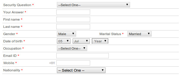
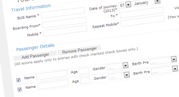
Forms are built for the kill by default, as they are a stop the users browsing flow needing them use the keyboard (until then 80% would have been using their computer mouse) to fill up the wired fields. So it is necessary to take this into consideration at the beginning.

A few problems with forms are, whether Sign UP, Login or any other all share a lot problems in common:
- Too many fields.
- Too Much Validation.
- CAPTCHAS.
- Poor Information about the fields.
- Extraneous requirements for password.
- Data Lost after Invalid/Incomplete submissions.
All these mentioned are unavoidable always to have a secure data, but it’s time to compromise the security for usability to stay ahead of your competitors. Let’s check the short solutions for these.
Too many fields can get user run away, if the information is unavoidable you can get them filled in steps or during different sessions, this will create a lot of difference. You can employ a Progress bar indication to inform the progress & open the access to sections of the progress level. The same principles apply for validation as well, validate in steps to make the difference.
Implementing CAPTCHAS unless required can bring a lot of loss for the business. Bolts can be removed manually, hiring an employee definitely won’t be more expensive than what CAPTCHAS can bring.
Make sure the user gets all the information required to fill the fields, without having them to correct them after the validation system pumps out errors it will get a – (minus) on you.
Extraneous passwords aren’t necessary, not unless you are selling weapons. Even Banks use other steps for verification than extraneous password, its always recommend to use other verification techniques.
When the server side verification gets a bad result make sure the data in other fields are saved, to avoid the user entering them again.
Multi Device / Screen Support
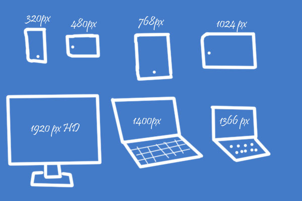
Devices are exploding, the world is now browsing on Smartphones, tablets, laptops, Desktops, even televisions entered into the web and more devices like Optical’s yet to come. We designers & Developers now don’t have any control on devices. The user are’t using the same product on multiple device, this makes it necessary to have perfect usability on all devices.
Conclusion
UX should be give the highest priorities on design list, as this is the only area the users work on. UX should not be added in half later or after the product launch. It can make the biggest difference in your new product, and will help you truly connect with the users. A solid user experience can help you to bring a smooth services for a long run.


