Informative and Effective use of Footer in Web Design

Footer is the bottom section of the web site, which usually have a bunch of links to other pages of the web site or to friend’s website, link to social media’s, contact address even a contact forum. But this not the only it can serve for you.
A successful footer will lead the visitor to other areas of your website and provide extra information. This will ensure any visitors will gain the full benefit of the information you are providing on your website.
Another great use of a footer is to include an enquiry or feedback form, this gives the visitor a chance to contact you at any point when viewing your website. This solve the problem for Visitor to search for Contact and fill out a forum to get in touch with you, as this is avalible on almost every page this affect the number of enquiries you receive as a result.
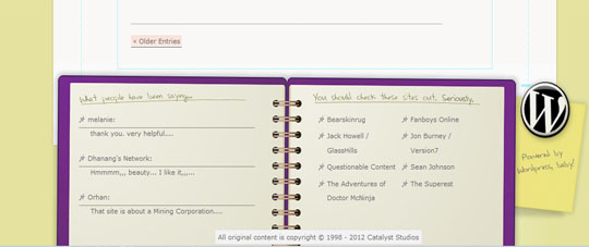
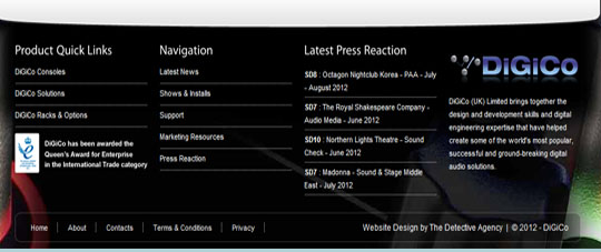
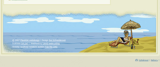
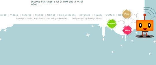
We have even made a small footer Showcases at the end of the article, though not many but a few which we found quiet amazing
Necessary ingredients
It is not unusual that anyone can get confused about what to include in footer. So before we more into design the footer, let’s talk about common elements to be included in footers and the importance of each. Of course it’s finally up to you to decide what all to include.
Site Map
This is a must have compenent for each and every footer, It can contain links to your about page, contact page and most importantly projects or archives page if you are having a blog. Since footer is on each and every page it helps the users to navigate to the key pages and it sends all the bolts that checks to that page at last the SEO rank shoots up, not much as other links from valued sites, but it will.
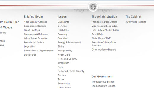
Whitehouse.gov privides all the major pages in the footer in appropriate section making it easier to navagate.
Short “About” Description or “Contact” Info
This is an excellent idea, because it allows users to contact you without having to navigate to the contact page. Many users won’t actually use it, but it provides added convenience to some. Mentioning the contact information like email address with a mailto: before the email address in an anchor tag doesn’t make much difference from the above one.
Providing company contact address and email in the form of text will reduce spam as its difficult to include a captcha in the small area.
But either way this doesn’t make much sense to user and no contribution to SEO, so its up to you to decide whether to preceded or not.
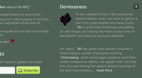
deviantart.com provides About description in the footer.
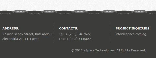
espace.com.eg provides contact info and a mailto: link to their email address.
Back to Top Links
Another must have compenent in footers is the “back to top” link. When a user scrolls down to find information in the footer or even after reading an article whether long or small, they don’t want to have to scroll all the way back to the top of the page. Though they can use the “Home” button on their keyboard (but it’s included on all keyboards), but most users don’t know about that function. The “back to top” link is one of those small details that really go a long way.
smashingmagazine Provides a back to top link at the bottom of every page.
Link to Full Site Map
It’s difficult to insert all the links in the footer especially if the site is quiet big enough. In this case, you can display a condensed site map in the footer with links to major pages or sections and then add a link to the full site map.
These are a few must have ingredients for a footer. All thought it’s up to you to decide on what to stick with
Positioning elements
Positioning elements is the key to success, what ever its. The Positioning here has nothing to do with CSS, what we are talking about is just styling.
This makes sure that all the bolts or spides that come to scroll your site reaches the site map after each page thus making surea that all the pages are index. This can make a great contribution to SEO
List Styling
A good list styling is important for site maps. Adequately spacing out list items is essential in Web design as it improves legibility and focus. The same holds true for site maps and other lists in the footer. Also, be sure to provide column titles more white space than list items, to convey the hierarchy better. Even the Title can be made bold.
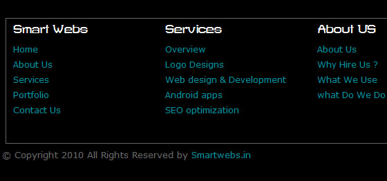
Smartwebs Provides a clean and simple layout with Bold title for each section.
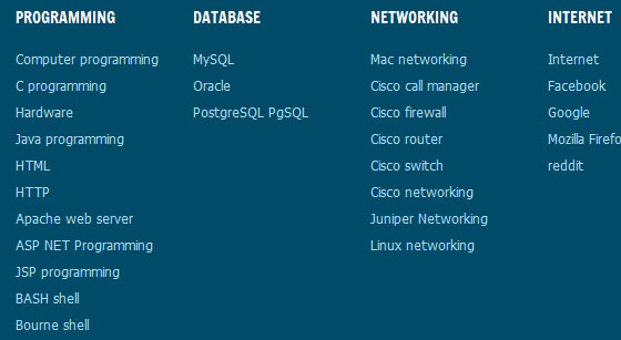
tech-recipes keeps a large footer to accomodate more links, it also make the title for each section bold. Thus making it easier to navagate.
Though Listing and styles has nothing to do with SEO, but we must keep in mind that out target is not SEO but humans. So we recommend you spend some time on this.
Categories links
This is very important when working on a large site map. If you don’t organize the links into categories, the site map will lack structure and be much too confusing to navigate with. You want your website to be usable, and a site map improves usability. But if the site map is laid out incorrectly, it becomes useless.
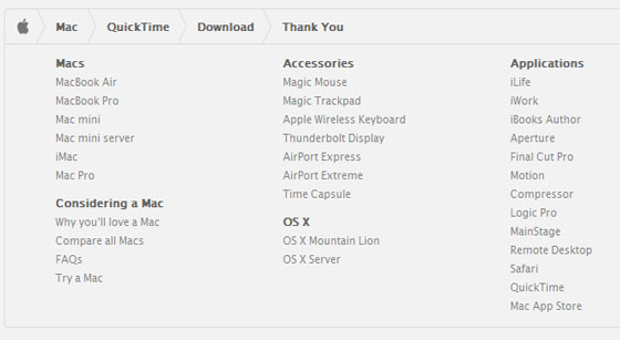
Apple does an excelent job of this. Actually, its website is so vast that it divides its site map into large sections. Each section (or a product) has its own individual section for links in the footer. Apple also does a good job of organizing the links into categories.
Below is a screen shot of apple’s quicktime download page
Extras for Blog’s
if you have a blog ,adding other kinds of information in the footer of a blog can be useful, too. Like recent posts , latest comment etc, can provide the user more confortable and even help to solve many other doubts which may not be his purpose for visiting, any wait it can invite a lot of hits.
Reecent posts and Comments
Blog footers commonly contain a list of 5 to 10 recent posts. This can significantely increase page views for as reader finishes a post and wants to read another recent post, they can simply scroll down to the footer, instead of going all the way back to the home page.
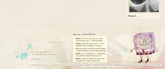
This is another trend in blog footers to list recent comments made by the users. As many don’t wants to see a stream of comments,as it contains mainly questions and recomendations so putting it in a prominent location, such as the sidebar, doesn’t make sense at all, SO put it instead in the footer. Its a common practice, as only a person who realy deserver it will scroll the comments of the page
In terms of SEO this can be handy as it ensure that all the lates post is scrolled immeditely when bolt makes a visit.
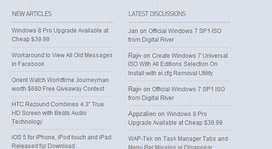
mydigitallife.info keeps booth recent post and comments in the footer.
Links to other Resources and Friend’s Websites
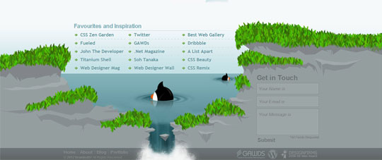
These area few things which we all will try often a bit, its also a comman way to build liks and increase SEO ranking , by linking yo your friends website and a link back. Although we have no recommendations in these , we have just shows it for Inspiration.
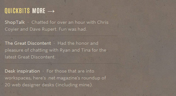
Here simplebits.com includes a list of interesting links, which some users will find useful.
This can play a major role in SEO for sure, more importantly makes the friend ship more stronger.

