Web designing has evolved quickly with time becoming one of the leading fields in the modern era of information technology. Designing a website requires careful consideration of the dynamics of technology and the needs of the users which greatly influence the effectiveness and popularity of a website. However, web designers could make errors that negatively affect the popularity of a website and its performance compared to other sites. For instance, shopping cart mistakes that occur when building an e-commerce site might repel users from enjoying the site, reflecting negatively on search engine optimization results.
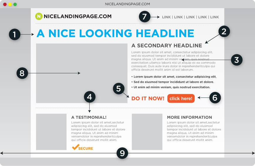
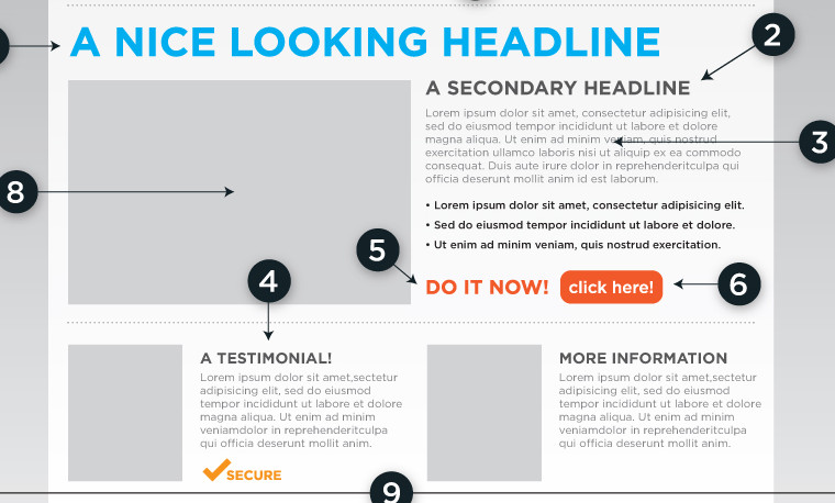
A landing page is a web page that appears when a user clicks on a search result or online advert. The page showcases the extended results from the search engine or advert link depending on searched items or topics. Mistakes in web design could affect the effectiveness and performance of a landing page.
Poor Logo Design
Most outstanding products and brand names have a unique feature through which consumers of the products identify them. However, research surveys on companies that offer web design services indicate that a many web developers seek services from friends, non-professional and unqualified individuals to create the design for them resulting into a poor logo design. A unique logo for a web page is important in popularizing the site and improving the bootstrapping.

Lack of a proper font
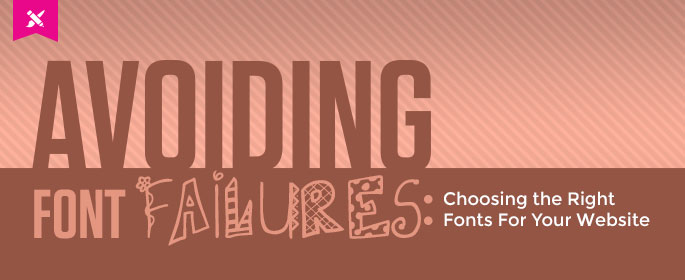
It is important for a web designer to use harmonized fonts and merge different fonts on the site, failure to which the page gives a wrong perception of lack of authenticity. Streamlining the fonts would not only make the page presentable, but also decent and professional. Some developers are misguided by the quest to create a stylish design using various fonts resulting into an unprofessional webpage outlook that visitors would not identify with.
Using too many colors
Color is a key issue in web page design as it helps catch the attention of the web visitor. However, using too many colors makes the page boring and cuts the site as unprofessional. Thus, using two or three colors in a web could be appropriate to make it catchy as well as preserve the professional part of the site, especially in on-line marketing platforms. The overall view is that colors on the web page should match the use of the site and meet the needs of the visitors. Web-pages with poor color mixes might perform poorly on search engine optimizations due to low traffic.
Organization of the Web page
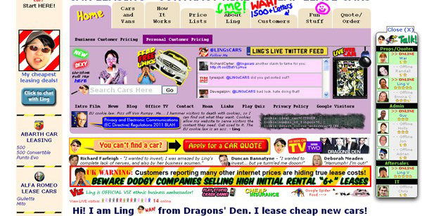
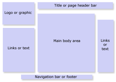
Organization of the type on the web page is crucial in ensuring that the content is readable and appealing to the web page visitor. Designing the web page using different font sizes and mixing block and small letters creates a disorganized web page. The implication is that viewers doubt the credibility and reliability of the site given that the designer did not employ professional organization of the page.
Objective
A web page has to be objective by presenting few items and easy navigation to avoid confusion. The main purpose for the landing page is to give more information on a search item or topic hence the need to present simple explanation. Visitors should have quick access to the items searched in order to increase traffic flow through the webpage. On the contrary, too many details on the lading page makes it complicated and deters traffic flow.
