20 Ways to Lose Your Visitors
The main area where a Web Designer have to focus when building a web site is with its user interface, the site must deliver a good user experience, which includes content readability , site navigation and much more, in order to stay alive in the Web Now.
There are lots of stuffs that can ruin the user experience, like Ads(Advertisement) , links and more, thought it brings revenue & traffic, if not implemented in proper way you are in a risk of annoying more readers than you gain or gained. Poor user experience can cause high page abandonment rates, poor performance in search listing, and most importantly creates a bad reputation among the users
In this article we will have a detailed look in the stuffs that creates the problems which can make your users to navigate away from your website and an advisable methods to handle some of them.
Pop-Up
The pop-up are really annoying whatever message it delivers, it make the user annoying. The most common usage of pop-up is to make users signup or to beg a like on Facebook or follow on Twitter. Though it’s a good technique to increase members or Followers, but i won’t bring any good for the web site, as this can have visitors abandon your site in annoyance leaving a like or a membership.
There are ways to notifying visitors you news instead of popping it up. Make the request innocuously. Don’t try to grab the user attention with flash or pop-up in the middle of the screen forcing a user to decide whether to dismiss it or click on it. Instead place the message in the bottom or right hand side of the screen, you can use a different color than the rest of your site. This ensure that the visitor notices it, without damaging the user experience. Make sure that the user gets the information that he needs first.
Over Crowded Text
With Over Crowded text the user reliably decreases which make it difficult for them to continue, this will definitely make the visitor leave the site in any moment. Not even over Crowded text even overcrowded images also have the same effect.

Over Crowded text like Election night crowd, Wellington, 1931. Source flicker:William Hall Raine
It is important to make sure the users can find what they are looking for, this make it necessary to make sure you break the texts into paragraph and insert images to make it interesting.
Make sure that the user is able to find what they are looking for.
404 Errors
404 Error happens when the material the user request is not available on the server. 404 Error is most unbearable error as it shows a lack of concern for your user and creates a bad impression with customers. There can also be a role from the user side in creating 404 error, check our article on 404 errors for more information.
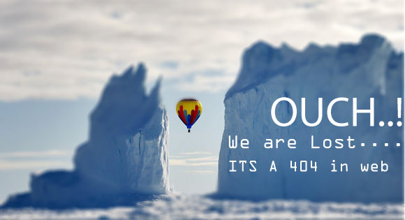
Image credit:National Geographic РоÑÑиÑ
Solution for 404 Error is quiet simple. Correct the link that does not exist or make a 301 redirect in to the new location if it’s caused by location change. 301 redirect will inform the Search engines about the status of change and also the users will automatically be redirected to the new location.
Create a custom 404 Error page to inform the user about the error and provide necessary solution to them.It’s really important that you go thorough your web site and make sure its working fine and gives the user a great experience.
Poor Site Navigation

If they are unable to navigate your website effectively or if the site structure is confusing , they will simply give up and leave. If you site is difficult to navigate, customers will eventually give up. They don’t want to spend their time searching or trying to figure out your website’s navigation. People simply do not like to work hard to find information online.
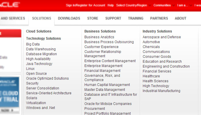
This is just to show an example for the readers, not with any other intention.
Don’t do this,this will make it difficult for users to find the content they need which can annoy them and leave away.Reduce the number of navigable items in menu,smaller & no more than three levels deep it make its easily navigable.
Site Search

You can provide a site search option to make things easier to find what they were looking for. Most of the CMS( Content management system) comes with search facility or is available as an add on. Google provides custom search tool for website. The free version is ad supported , Google also allows you to link your adsence account into search. For a small payment you can convert it completely into Site search with no ads.
Cross Browser Compatibility
It is necessary to make sure that a website is compact-able with all famous browsers If you want your website to be accessible by everyone, then it needs to function properly in common browsers like Google Chrome, Mozilla Firefox , Apple Safari and IE. It is a difficult task to do but if not with earlier versions, make sure it works with the latest version at least.
HTML Tables
Building a web site out of tables is like listening to music with a Walkman CD player, in the world of IPods and MP3 players. Instead use XHTML and CSS which are easier to use that tables and is more efficient for any jobs you need.

Image Source: flicker davydubbit
There is nothing wrong with tables, and you should still use them if needed, just don’t make your whole website with tables.
Website With Flash
Flash web sites are super cool…. and easier to build than compared to the HTML & CSS. Flash websites need to download all the necessary components which have heavy content in most cases, before it starts to show the website it can take a long time to load, even on a broadband connection. More importantly search engines will not be able to index the pages on the site. It also wants the client to have flash player installed in, which is not possible in some mobile devices.
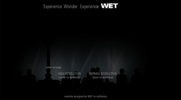
Wet Design has an awesome looking website build on flash, it took 3 to 4 sec to load the whole website in full resolution mode when we tested till then it showed a progress bar with percent of content downloaded on a black screen.
www.wetdesign.com has only 5 pages indexed on Google, with inappropriate titles. This decreases the web site performance in search,which makes you to do heavy manual promotion.
Stupid Background
When it comes to reading the background and text colour (color) is important, make sure that the text can be read clearly without problems and the background behind the text is plain, white background with black text always rocks as text printer on paper.
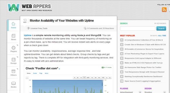
webappers have a texture-image as the site background and displays the text on a white background.
Rubbish Software For Content Management
If you plan for a big website that has many functionalists like shopping cart, Discussion Forums , blog or any other functions which need user participation. Try to go for premium software’s don’t use free open sources like Vanila forums, SMG and few other free one for Discussion board go for vBulletin or Invision Power Board even phpBB is not recommended, though its a good one but it give the visitors an impression about how concern are you with the forum.
But it does’t mean all the open sources are bad in case of blogging platform WordPress it’s not just open and free its the best Content management system that you can ever get in the internet. Not only WordPress, few other CMS like Drupal, Joomla are also superb.
Automatically Multimedia Content
This is the most hated part by any internet user, i.e when you have some video or music on your web page you don’t want them to start playing automatically or even download it, you just need to inform the user about the available content and provide the necessary controls to them.
Downloading the content to client browser can also get the user annoyed as in some cases it can increase the data rates if the user uses an internet with limited data transfer. Making the medias play will test the patience of the user to the end, especially when in an environment where he needs to be silent.
Web sites are entirely different from other media like Television or Radio, the users browse the information on their will not on the web master control so it’s necessary to make sure that the user get the complete control.
You Tube downloads the video to client browser and starts playing, though it looks annoying but You Tube only plays the video only when users click the link for video alone not in home page or any other pages.
Vimeo another video sharing site provides the user complete control even on the video page, it starts the download only after user agree to play.
Splash Page
Splash Page refers to a page that is displayed before you enter a website which says click here to enter, it is necessary in some cases where the user need to agree upon some policies in order to access contents such as pornography, advertising, or gambling (as is required by law).
I all other cases the Splash Page get a thumb down from all, generally with heavy images or media it can take a long time to load for people with a slow Internet connection. It is just like having a huge wall without entrance path around the office requesting clients to jump over it to reach you. Though it looks cool in some cases any way it annoys the user.
Under Construction
Sorry, this section is still under construction
If you use the internet for a month you may have seen across these line countless times. Most websites like blogs are and will always be under construction as pages are constantly added, edited and reworked continuously.
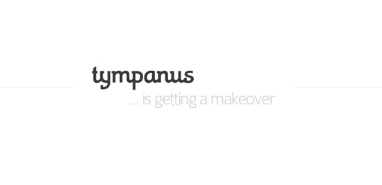
Tympanus shows a clean and neat page when in construction.
It is not necessary to inform the user about your website status in certain sections or in between the contents, it is better not to make the website accessible before the site is completed. Just make something there to inform the users, like what the site is going to be when it will be finished, and ask people to bookmark it or subscribe providing the email. If you are making a brand new website, just don’t put your site on the web until it is finished. Don’t allow a site to be found until you think it’s ready.
Too much advertising
Advertising is fine; and a part time or full time blogger need the to get the site surviving. You can have up to a maximum of 4 ad units making it more that 4 will create problems. Don’t use RUBBISH PUBLISHER NETWORKS , try to go for Google Adsence or BuySell Ad network. Though it’s difficult to get into them since they require a site to meet certain minimum requirements but it’s worth it as, these networks make sure that the Ads are of proper content and does not effect your reputation.
“Please visit my sponsors. I am just a poor student.â€
Never ask your visitor to click on the ads, its against one of the main policies of all major Publisher Networks, you can get banned for this. Always try to make the user satisfied.
Slow websites

Image Source: Flicker Nicky Adriaens
Every one can understand that slow websites drive people away than any other reason. It is necessary to make sure that your website loads in less that 2 seconds on a broad band internet connection, even if not completely make it load at least the content.
To make your website load faster you can compress the file size of your HTML, CSS, scripts, images etc. under 30 kilobytes.You can even send the data from the server compressed. Avoid using big graphics,don’t overload on ads, code efficiently, Cache the website in client browser. Go for a decent web host too, as the response time of your server will also have to be factored in.
Check our article on web site speeds
Having A Counter On Your Website
Displaying a counter on your website is disgusting, it looks very bad. You don’t have to show number of hits you had to the users, they only need to know the content not the number of users for the website. There are other site like Alexa and Compete.
Things that you can show are your RSS Subscriber count and your Twitter Followers even Facebook likes.
Displaying Counter is useless because they only track one element of site statistics which is just required for the web master alone. There are a lot of free Analytic tools which does not give any links or brand names on the site,You can try Google Analytics or Clicky for a real-time solution.
Bad design
Another Factor after Web Site speed which can let user drive away is the Design. Try to make a good looking design.If your site looks sloppy it will make the user to take a perception that your business is sloppy too. Make sure the design matches the company or the topic or else you may end up convening a wrong message
Lock Copy And Pasting
Websites which have a lock on right mouse button, that prevents people from copying can be very annoying. Most case they are just trying copy, don’t lock right mouse click with java script, even if you did there are ways to copy the content, its better not to lock.
Contact Information
A contact form is not enough. You need to display a telephone number and email address. If you user Twitter, Facebook or some other social network then add that too. Adding your contact information, especially your telephone number, provides legitimacy and makes it easy for prospects and customers to reach you. If you make it difficult, they will simply not call and go somewhere else.

Image credit:National Geographic РоÑÑиÑ
If you have blog make sure you provide users facility to comment, it’s good to make it open comment thought it needs moderation. Try to reply to the comment as early as possible if it’s a question, don’t forget to thank the user if it was a recommendation or correction.
Update Contents Regularly
If you have a blog make sure that you have new post in regularly, try to have a minimum of 5 to 10 post a month. More importantly make the post more descriptive and informative as possible, the content must of highest quality.
Not Including Share Buttons
Image Source : Flicker: Sean MacEntee’s
In today’s social world. People like to share things. From business part every one need people to share you content as it brings traffic without any payments.Make it easy for people to do this. Don’t forget to add social buttons to your posts, you can hide the counts if you don’t have a decent figure. If you find it difficult to integrate all the social networks try Add This, it’s a platform build to share.
Did I Miss it
Is there a website problem that users hate that I didn’t include? Share your thoughts in the comments section below.


