Dexter CSS 3

The Following example will only work with the following browsers only.In opera the rotation may not work.
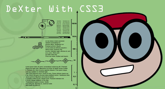
We use this example to show you the power of CSS3, .i.e. using the different properties of CSS3 like border-radius, rotate etc different shape can be made easily with those shapes we can make super shapes that is characters.
The character Dexter is made with oval, each positioned with relative positioning, and even other methods can also be used
The Mark UP
The CSS
1.Hair
The hair of dexter in the example below we have not used the positon and z-index properties.But the rest remains the same
#head{
   display:block;
   width:390px;
   height:100px;
   background-color:#a00024;
   border:10px solid #000;
   border-radius:60% 70% 50% 50%/60% 70% 30% 40%;
    /*rotate */
    -webkit-transform: rotate(-5deg);
    -moz-transform: rotate(-5deg);
    transform: rotate(-5deg);
   /*position*/
   position:relative;
   top:120px;
   left:100px;
}
Example
2.Optical and Eye Balls
The eye balls are kept inside the Optical, we have used eye for Dexters Optical in CSS you can change it if needed,both are ovals indeed, the two eyes only differ in positon and the rotation angle
#eye-1 {
   display:block;
   width:226px;
   height:280px;
   background-color:#87a0aa;
   border-radius:50% 50% 50% 50%/50% 50% 50% 50%;
   border:25px solid #000000;
   z-index:4;
   /*rotate */
    -webkit-transform: rotate(-10deg);
    -moz-transform: rotate(-10deg);
    transform: rotate(-10deg);
   /*position*/
   position:relative;
   left:2px;
   top:40px;
}
#eye-1 #eye-ball {
   display:block;
   width:96px;
   height:120px;
   background-color:#000;
   border-radius:50% 50% 50% 50%/50% 50% 50% 50%;
   /*position*/
   position:relative;
   top:80px;
   left:90px;
}
#eye-2 {
   display:block;
   width:226px;
   height:280px;
   background-color:#87a0aa;
   border-radius:50% 50% 50% 50%/50% 50% 50% 50%;
   border:25px solid #000000;
   z-index:2;
   /*rotate */
    -webkit-transform: rotate(10deg);
    -moz-transform: rotate(10deg);
    transform: rotate(10deg);
   /*position*/
   position:relative;
   left:280px;
   bottom:410px;
}
#eye-2 #eye-ball {
   display:block;
   width:96px;
   height:120px;
   background-color:#000;
   border-radius:50% 50% 50% 50%/50% 50% 50% 50%;
   /*position*/
   position:relative;
   top:80px;
   left:60px;
}
Example
3.The forehead
There was a little white gap between the two eye balls, we filled that with a square , since its a normal square made with width and height applied to a DIV we have’t shown a example
#for-head{
   width: 140px;
   height: 100px;
   background: #d1b9b0;
}
4.Mouth and the Jaw
Though both are different we included them both to avoid article becoming to lengthy, we used oval shapes for both, though not completely oval, mouth is semicircle, and the jaw is almost a circle.
#jaw {
   display:block;
   width:580px;
   height:426px;
   background-color:#d1b9b0;
   border-radius:40% 40% 50% 50%/60% 60% 50% 50%;
   border:14px solid #000000;
   /*rotation*/
	-webkit-transform: rotate(-5deg);
	-moz-transform: rotate(-5deg);
	transform: rotate(-5deg);

}
#mouth{
	 height:45px;
     width:240px;
   	 border-radius:30px 8px 90px  80px ;
     -moz-border-radius: 30px 8px 90px  80px;
     -webkit-border-radius: 30px 8px 90px  80px;
     background:#FFF;
	 border:7px solid #000;
	 z-index:3;
	  /*rotation*/
	-webkit-transform: rotate(-5deg);
	-moz-transform: rotate(-5deg);
	transform: rotate(-5deg);
}
Exaple


