
Maker Party Logos with CSS

Maker Party is Mozilla’s global campaign to teach the web, with help from thousands of volunteers and community-run events around the world. Maker Party unites educators, organizations and enthusiastic web users with hands-on learning and making. More Information on Maker Party
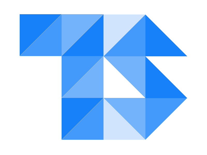
Maker Party is a Campaign that is all about making, after organizing few maker parties and getting thrilled with makes generated during the event, I thought of making something on my own. CSS has been my favorite web scripting so I planned on to go ahead with some CSS mix-ups. I choose to remake the Maker Party resources (logo and word mark), because I didn’t find one.
It has been an year since since I used the extreme features in CSS to make logo’s or shapes, my previous experiments with CSS :
To make it easier to understand the CSS styles are arranged into different files.
shapes.csscontains the CSS that make the hexagonal shapesletters.csscontains the CSS that makes the Maker Party Word-mark

Maker Party Word-Mark

Let’s get started with the Maker Party Word mark, The word Mark is composed of rectangular Blocks arranged in different positions & directions. In this example the rectangular boxes are given a dimension of Width = 20px and Height = 100px for Vertically aligned rectangles and the opposite for the horizontal once.
The slant boxes in the word marks are Parallelogram, made by applying transform: and skew( property to a rectangular box, in this example the angle of transformation are 20degrees, 30 degrees & their negative values for reverse.
The semicircular rings for P & R is made of rectangular boxes with border-radius greater than their height, this doesn’t make them completely. but you will end up with a capsule like object. Now set the background to transparent and give a border of desired thickness and color.
This makes up all the shapes required to make the Maker Party word mark, with a little more magics using CSS position you can end with Maker Party with CSS.
.letter{
         width: 25px;
         height: 100px;
         background-color: #00B0B7;
}
.parallelogram-letter{
         display: inline-block;
         width: 25px;
         -webkit-transform: skew(15deg);
         -moz-transform: skew(15deg);
         -o-transform: skew(15deg);
}
.parallelogram-letter-inv{
         width: 25px;
         -webit-transform: skew(-20deg);
         -moz-transform: skew(-20deg);
         -o-transform: skew(-20deg);
}
.horizontal-letter{
         height: 20px;
         width: 60px;
}
.circuar-letter{
         width: 30px;
         height: 20px;
         background: transparent;
         border: 20px solid #00B0B7;
         border-left-color: transparent;
         -moz-border-radius: 50px;
         -webkit-border-radius: 50px;
         border-radius: 50px;
}
Adding the Positional Magic to the styles will end up in a Maker Party word mark made of CSS and HTML.
Maker Party Logo
With Word Mark in hand, all you need is a hexagonal container to wrap the Maker party Logo in place.The hexagonal shapes consist of three sections
- Top Triangle
- Center Rectangle
- Bottom Triangle
.hexagon .top{
         width: 0;
         border-bottom: 180px solid #00B0B7;
         border-left: 280px solid transparent;
         border-right: 280px solid transparent;
}
.hexagon .bottom{
         width: 0;
         border-top: 180px solid #00B0B7;
         border-left: 280px solid transparent;
         border-right: 280px solid transparent;
}
.hexagon .center{
         width: 560px;
         height: 240px;
         background-color: #00B0B7;
}
HTML codes for the hexagon
With easy to hack build ready, I am hoping to find more hacks & creative ones of Maker Party word mark soon.

