4 Core Principles of Flat Design

Rumors that were swirling around Apple’s upcoming iOS7 release did initiated a lot of discussions & talk about flat design. As we move into mobile world expecting to see extraneous details omitted in favor of functionality, mainly in design, the drive to make something look good tends to shift away from the details that will make something more efficient and easy to use.
What is flat design..?
In short, this philosophy preaches that if something doesn’t help usability, leave it out of the design. Let’s take a deeper look at the elements of flat design, along with some stunning examples.
Focus on Color
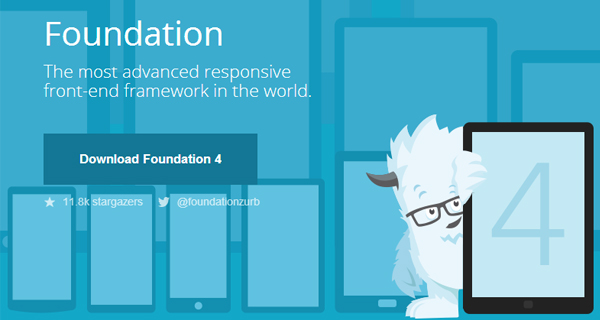
The website of Foundation (a Responsive frame work from zurb) is an excellent example for color.
Color palettes for flat design are often bold and use many hues (just think of how the very colorful Windows Phone palette). Using bright, saturated colors, you can add distinction between elements and make certain things really pop without adding any additional design clutter. Monotone color palettes are also common in flat design, as pictures in the example above. Flat design is closely related with print design but now with the increases pixels that are available, there is less tricking of the eyes with flat design. Flat design takes away many of the different qualities that aren’t needed or increase efficiency. In simple terms, if it doesn’t have a direct use then it doesn’t have a place in flat design. This is the bare bones approach that many in the business world like because the efficiency increases when looks are sacrificed for functionality.
Choose Meaningful Phases
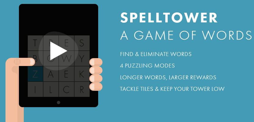
spelltower a game of words, has a bundle of eye opening phases which can trigger actions.
Flat design doesn’t use large chunks of text, so you’ll need to choose your words carefully. This also makes typography extremely important; you’ll want to use sans serif font families that offer a variety of weights. Not only are the words important, but the colors are also important. One may ask themselves, why is this important? This is because the brighter colors tend to promote the clicking of the functional buttons that are associated with flat design.
UI Elements

spelltower (a Design Agency) did spend few pain staking hours in crafting the company website has a remarkable UI.
Forget about using shadows, embossing, gradients, reflections, textures, and dimensions to make buttons and icons stand out. Since flat design forgoes “flashy” elements, opt for simplicity when it comes to buttons and other clickable items. Instead, use outlining, typefaces, contrasting colors, and rollovers to draw attention to certain elements.
Visual Hierarchy
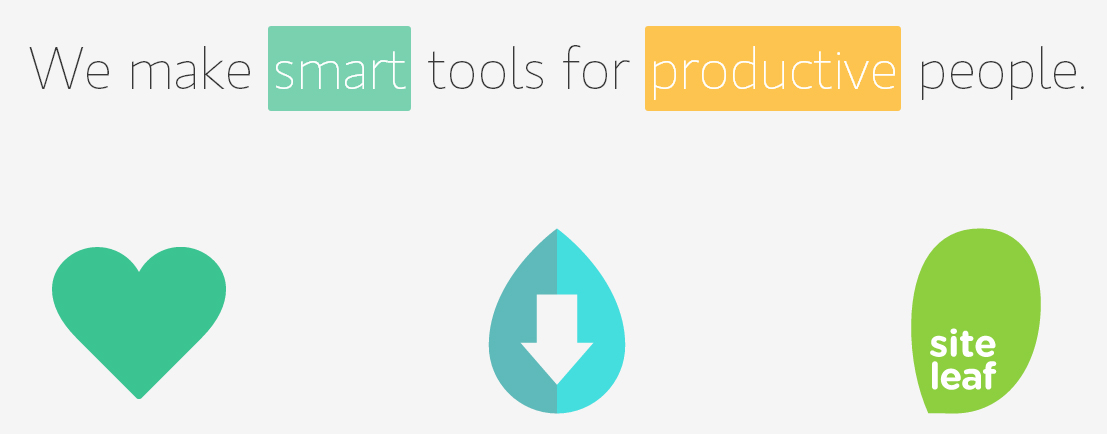
spelltowera Design Agency based in NY, the Visual Hierarchy of the website is a ground breaking.
A common argument against flat design is that there’s a lack of distinction between elements (no shadows or gradients), making it difficult for users to know where to click. Overcome this issue by creating a strong visual hierarchy. Clickable items can be distinguished using size, color and text. In the first example above, all of the hyper linked items are emphasized with color. As flat design keeps expanding especially with the newest and trendiest gadgets incorporating it, the recognition of where to click and queues will continue to grow.
There are certainly challenges involved with effectively capturing this design aesthetic, but as you can see the obstacles pay off when it’s done properly. An added bonus of flat design: whether someone is viewing a site via 4G, DSL Internet or even a dial up internet connection the lack of “bells and whistles” in this design style can help speed up load times. The more time that one has makes the flat design the way to go for those who are designing in large volumes.
What are some challenges you have faced when using the flat design aesthetic? Let us know in the comments below.
