Optimizing Web Site for Mobile Audiences

credit Pixel Fabric for Every thing in the above image
Like any savvy businessperson, you likely already have a website designed to serve customers and promote your business, but are you thinking about the devices your potential customers use..? If not, you should be. Your customers are moving to small screen devices and the trend is increasing.
Read on to find a few ways to make your site more appealing to mobile users.
Use Responsive Web Design
Pull out your smartphone and take a moment to access a website that is not adapted for mobile use. At first, everything is minuscule, so you must zoom in. Once you zoom in, you have to scroll to the icon you want to select. If the icon is still not large enough for you to tap it with your finger, you have to zoom in again. Are you annoyed yet…?
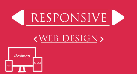
With responsive web design (RWD), no matter which device the website viewer is using-be it smartphone, tablet, or desktop�the content appears in an easy-to-navigate and visually appealing way. The elements of the website adjust themselves automatically to suit the screen size of the device.

RWD is important for more than friendly user experience, however. Some companies maintain two separate websites- a desktop version and a mobile version. With responsive web design, that isn’t necessary because you can pay to maintain just one website. While RWD is initially more expensive than traditional website design, in the long run it will save you money. Having just one site for your business also has a positive impact on SEO.
If you can’t yet afford to redesign your site in RWD, don’t worry. There are still many ways to make your site mobile friendly…
Consider Mobile User Intent
A mobile user has different needs than someone sitting at their desktop PC. They are probably on the move when they access your site. In other words, they don’t have time to comb through your site for the info they want.
While PC users are more likely to browse around your site, mobile users want information to be direct and to the point. Focus on a few simple actions mobile users probably want to do: call your business, find your physical location, or look up product information. Your phone number, address and additional contact information should all be in a prominent position. For brick-and-mortar businesses, integrate Google maps on your contact page so mobile users on-the-go can easily navigate to your location.
Optimize Performance
As mentioned above, 80% mobile users are usually on the go. They want information as quickly as possible & before they reach their destination, and slow load times can send visitors out. Strip your design of anything that is slowing your site down and follow best practices for site speed.

Auto-loading videos and music are definite don’ts for mobile design. Also, many devices compress images, so you don’t want to place any important text within an image since it may not load properly on a mobile device.
Rethink Developing an App
You could also have mobile apps for your business. Of course, make sure to build one for all platforms Android, BlackBerry, iOS and Windows or for more OS. A few advantages of having a App are:
- Your App will stay in users menu and will easily get their attention frequently.
- You can have push notification.
- and more…..
An app must be perfectly crafted to get all those benefits, if not all the spending you did will definitely go waste.Carefully consider if the cost of developing and maintaining all those apps is worth it. Do you really need an app when you can just put your budget toward a mobile-friendly site instead…? it’s for to answer
Don’t Forget Internet Speeds
The Internet Speeds are still a major drawback for the internet itself. After 20+ years of establishment people still are using the slow speed GPRS & satellite Internet connections to view the websites, which means it’s absolutely necessary to make sure your mobile website can over come this obstacles also.
That, coupled with the proliferation of mobile devices, means you should do everything in your power to make your design appealing to users regardless of how they access your site.


