UX Mistakes 2

It has almost been a year since I listed out a few UX Mistakes Made on the Internet by Developers & Designers including me. It was just a few. I listed them out because those were a few mistakes that comes with high consequence, and I Indeed was a victim of them.
But those were not all, so i decided to make the Version 2 of the UX mistakes, listing a few more potential disasters.
Issue with Forms
Forms are built for the kill by default, because they stop the users browsing flow forcing them to use the keyboard (until then 80% would have been using their mouse/Track pad alone) to fill up the wired fields. I did mentioned issues of killer forms in my previous article UX mistakes, so I am not gonna explain here about them and make this big article even bigger.
Return Key Submits Form
Forms themselves being a killer, Return/Enter key not submitting the form will make it worse. This shortcut will give users an easier way to submit forms with a click on the keyboard than using their Mouse/Trackpad to click the submit key.
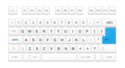
Compact Keyboard by Ondrej Lechan
This is a must have for login & user registration forms, if you don’t have them you have high chance of losing users
Auto-focus
The moment a form is encountered the users prepare them-self to switch to the keyboard, its quiet natural. Not every one uses a laptop where the keyboard and track pad are close by, so they have to complete transfer their hands from the tracking device to the keyboard.
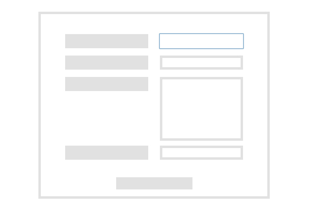
If the form can auto-focus onto the first input field the users can start filling them, without using cursor and navigate to it.
Users with a little experience on internet users makes this transition from pointing device to the keyboard even before the page loads, so if you form doesn’t focuses onto the first input field the user need to switch back to the pointing device & navigate to field, which can send them away.
Improper Position of Inputs
With CSS there is nothing that isn’t achievable, the issue of over using the power of CSS can bring problems with forms. As mentioned above users have to make a transition from Mouse/Track Pad to their keyboard to go ahead with the forms, which makes auto-focusing the first input a must have.
It doesn’t solve all issues, there is more. After filling in each field users use the Tab Key on the keyboard to transfer the pointer to next input. As long as the inputs are styled in the same order as they are in the HTML it’s not an issue, but if CSS position or other techniques are used to alter the order of the form, it invites trouble.
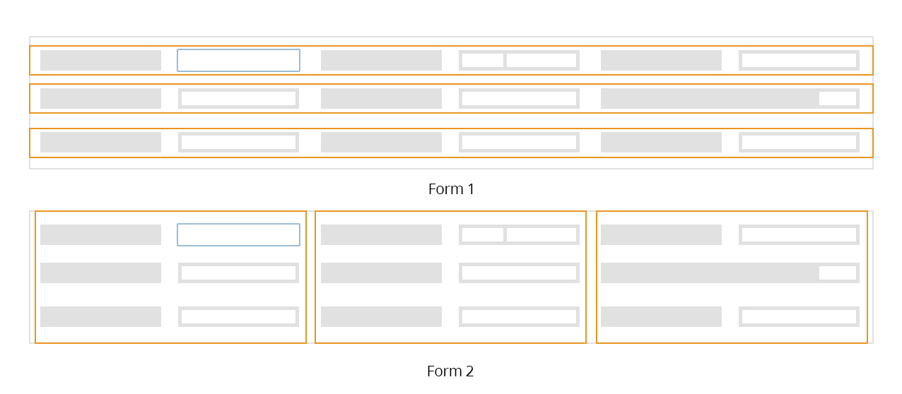
Given Above are 2 Form’s, Form 1 & Form 2 styled in different order, check the demo to feel it in action .
Form 1 : The inputs in Form 1 is styled as they are arranged in HTML that is in horizontal order, this allows users to navigate to the next field using Tab Key on the keyboard.
Form 2 : The inputs in Form 2 is styled in a vertical order, the successor of each inputs come below them, so if you try to navigate through using Tab Key on the keyboard you will end up going down rather than sideways.
Either of the above styling allows navigating through the fields but, the Form 2 is more distracting to user than the first one, especially when user is asked to the same input for second time like password & other details the pointer moves to another input.
Coloring Anchor Tags
Anchor pages are common, almost every web pages have them to help users navigate to different sections of the website. Website use different styles for Anchors to make them stand out of other elements. They also have some WOW looking hover state accompanied with some super cool translations. But what most website don’t have is another state which can improve usability far better than you can think of.
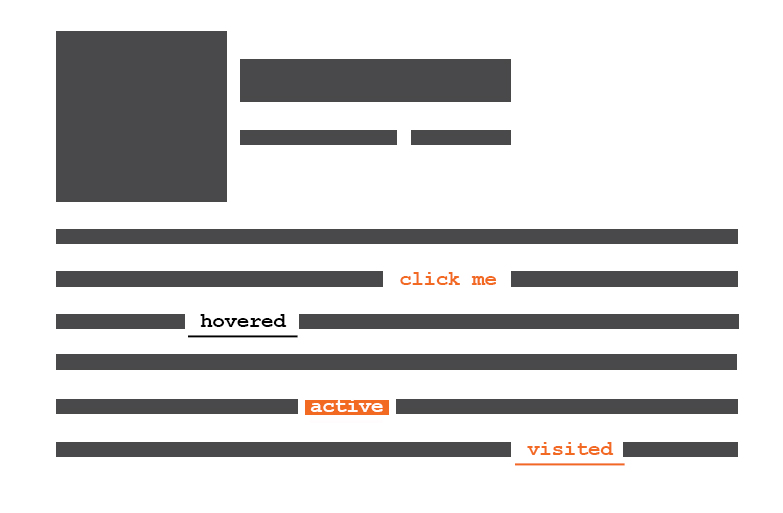
That is not all of it, Anchor tags actually have 4 States
- Normal State
- Hover
- Active
- Visited
The first two states are so common everyone use it without fault, and the :active state by a few. The most important of all the :visited seems to be ignored by many, thinking it’s is not a necessary for a normal website with lower contest, even blog seems to ignore them. Whether you have a Wikipedia or not informing about visited links is as important as informing its an Anchor tag.
The :visited state allows the users to identify the links they visited and others, with out them users can end up opening same page twice or more times. This can be a serious problem if you have a bundle of links in product page, which can end up user getting lost.
The visited state can be styled in CSS using the Pseudo-classes Selector. Browsers come with style for visited links but style applied to the Anchor tag overrides them, which makes it necessary to define them.
There is a little conspiracy with the name UX Mistakes 2, I took the name UX Mistakes 2 because another article with title UX mistakes already exist and I don’t bots notifying me for duplicate title tags


