Maximizing Your eCommerce

So you’ve decided to create an eCommerce site with WordPress. As great as that step is, it can be overwhelming especially with all the smaller moving parts. From design to navigation to infrastructure to security, you need to make sure your site is built for maximum exposure and results. This could take time because it’s more of a process than one-shot-and-done; you just need to find a way to make sure you deliver the best solution to potential buyers.
Emphasize Security
In the U.S. alone, security breaches cost close to $200 per breach. Customers are already nervous about sharing personal information online and need assurances that their information is safe. Make sure your site uses Secure Socket Layer, or SSL, to encrypt transactions and that it is PCI compliant. Whether you’re using a merchant account or an ecommerce hosting company, make sure that both of these parameters are satisfied. Remember to let customers know by placing those badges in the footer of your site.
Feature Top Sellers
Once you get some sales under your belt, you can better understand what’s working and what’s not. When you’re talking about products, once you have an understanding of your top sellers, share them with visitors. Building an eCommerce for WordPress site means you have the flexibility of integrating plugins and themes that can emphasize any features you want. You don’t need to be an expert; you just need to download a simple piece of code and set it up. Being able to show others what you top sellers are gives you a more established look.
Make Checkout Easy
Easy checkout can never be emphasized enough because it’s one of the features that is taken for granted. The first step to doing this is to make sure you display your payment options and try not to limit yourself to just one. PayPal may be popular but there are some people who do not like them. The same goes for Google Checkout. If you are able to show customers that they have choices, they will feel more comfortable with spending money with you.
Too many sites put a lot of obstacles between the customer’s credit card and the authorize button. Reduce the need for the customer to input redundant information by using check boxes and auto fill. For example, if a customer enters a zip code, the city and state should auto fill, which shaves seconds from the checkout process. If you can do it, make the payment processor seamlessly integrate into your site and avoid sending customers to a third party site. Keeping customers on your page can help reduce load time and by extension shopping cart abandonment.
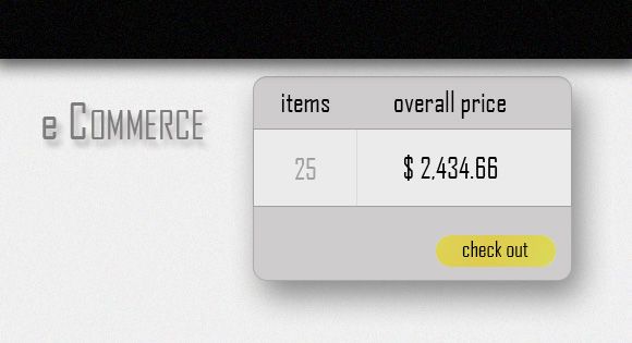
To reduce the chance of shopping cart abandonment, you can integrate a persistent shopping cart that will have the items waiting for the customer whenever he’s ready. There are many reasons why customers abandon a purchase and not all of them have to do with being disgruntled with the site. Using this trick can really help your conversion rate and save a lot of time for the customer when he returns.


