All it matters for a task is it’s outcome whether it be a piece of work assigned or done as part of one’s duties. In the competitive and distinctive world, getting the task completed from a user without scaring him away is a bone breaking task for a Developer & Designers working behind. This is where the Progress notification comes handy. Not only inform the loading or buffering information they do
- Inform the Status of task: The remaining part is what highlights and gives a challenging sensation
- Provide survey satisfaction and respondent engagement during a survey.
- Get the task completed from user
Since they show the user how much task is left and allowing them to estimate the time required they are good converters. So I was working to get a notification with step numbers for Mobiopush. As always I’m found of CSS and I want to achieve this with CSS.
With the demos I’m indenting to get this notification achieved with low effect on page load times, I have seen people using JPEG & PNG images to achieve this, it was only way in the past but not now.
This is a simple concepts that can ignite your imagination. I have created two versions
- Progress notification with Step Description.
- Without Step Description. Just step Numbers
Note : The demo uses JavaScript to showcase the movement from step one to another but you may do the same from back-end serving the Markup with appropriate classes.

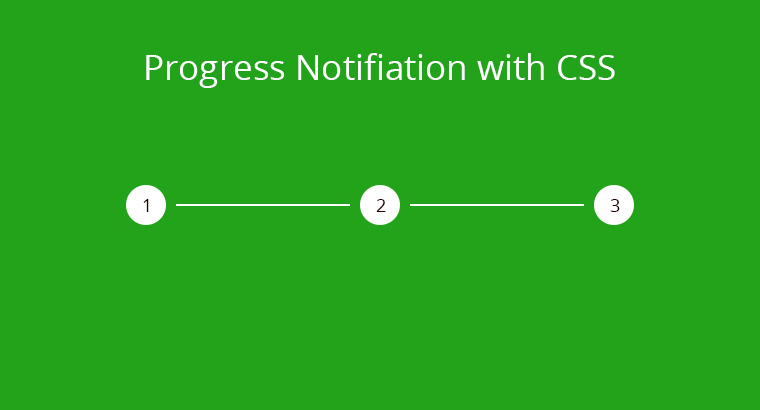
Here are the screenshots of the demos
The Markup
I’m gonna explain the one with description for steps here because the other one is just a clone with some removed contents.
-
1
This is step one
-
2
This is step two
-
3
This is step three
Here the li with class="steps" denote the steps, which includes the step number and the description, li with class="separator" make up the line that separates the steps and makes then identifiable.
The steps and separators have color property to indicate once that have been parsed by the user, to be parsed and the active one.
The Style
Here come the magician that makes it all happen, no doubt he is the hero. Let me brief out what is to be done with CSS to make it a super hero.
- Remove the default styles of unordered list and get it match us.
- Get the Process number & description styled and aligned.
- Choose three color combinations so that the three steps
- Done
- To be Done
- and the current one
are clear and legible. At the end we are here to notify the user his position so color selection is the key.
And more you can add, Let’s see how things actually work.
We apply class to the li elements to set the appropriate one as Finished, active or to be done. We have to apply the similar class to the separator to get the flow effect.
#progress-bar ul{
	list-style: none;
	padding: 0;
	margin: 0;
}

#progress-bar li{
	display: inline-block;
	vertical-align: middle;
}

.separator{
	background-color:rgba(149, 165, 166,1.0);
	display: block;
	height: 5px;
	width: 150px;
}

.steps{
	text-align: center;
}

.step-no{
	background-color: rgba(149, 165, 166,1.0);
	border-radius: 30px;
	color: rgba(255,255,255,1);
	display: block;
	height: 30px;
	margin: 0 auto;
	line-height: 30px;
	padding: 5px;
	text-align: center;
	width: 30px;
}

.description{
	color: rgba(255,255,255,1);
}

.active{
	background-color: rgba(231, 76, 60,0.8);
}

.completed{
	background-color: rgba(192, 57, 43,1.0);
}
That is all folks….! we have created a progress notification using CSS. Hope you enjoy the demo.
Note : The demo uses JavaScript to showcase the movement from step one to another but you may do the same from back-end serving the Markup with appropriate classes.


