5 Elements of Websites that Convert

Whether you’re selling products, services or information, you want your website visitors to convert. Your goal is to get visitors to sign up for your newsletter, to request more information via a form or make a purchase. Here are five essential elements to make your website a conversion machine.
Strategically Placed Call-to-Action Buttons
Call-to-action buttons should be clearly differentiated from other page elements with bold and contrasting colors. A call-to-action should live above the fold and be in line with the visitor’s natural eye path.
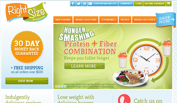
Right Size, which makes smoothies and other weight loss products, uses this concept well on its website. Notice how your eye is drawn to the “Shop Now” buttons. There are also two buttons, which will capture both visitors who tend to scan down the page and those who scan to the right.
Scan able Copy
Your website copy must be of high-quality but also scan able. People tend to read only the beginning and the end of a block of text. Put your most important copy here. It’s also a good idea to break down copy into billeted lists and by meaningful subheadings to help visitors grasp the most important concepts with a quick scan of the page.
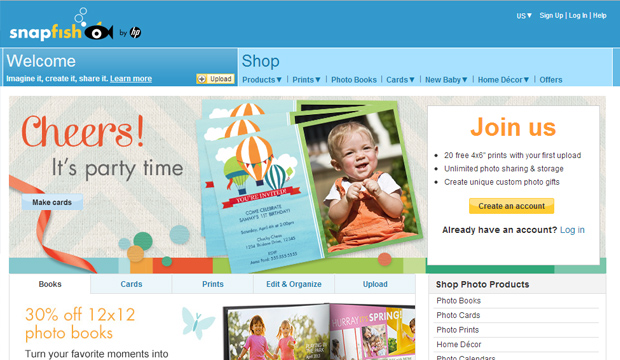
In Snapfish’s there’s a lot of information conveyed on the page, but the content are still easily scan able thanks with the use of headings and bulleted lists.
Most Important Elements above the Fold
All the important elements of a website should be placed above the fold. If you don’t entice visitors when they land on your page, they’ll bounce before they scroll. That means major headings, product photos, incentives & any other thing designed to guide visitors closer to the conversion.
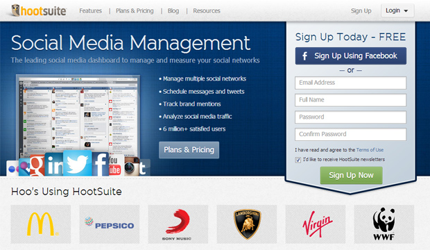
In HootSuite everything is scan able and gets the point across. Visitors have no reason to scroll down.
Customer Testimonials
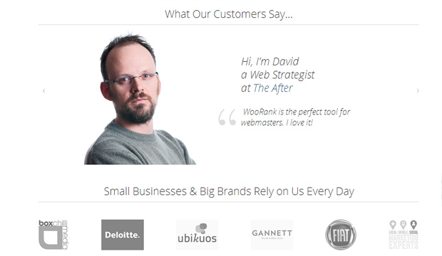
Customer testimonials are one of the most effective ways to turn visitors into conversions. Testimonials add credibility and provide evidence that your products or services actually work as intended.
Woorank includes plenty of testimonials and success stories, providing on-the-fence visitors with plenty of convincing information to encourage them to try the products. You don’t need to use celebrities for testimonials to be effective though, asking a handful of satisfied customers for testimonials can be just as powerful.
Everything on the Page Leads the User to Take One Desired Action
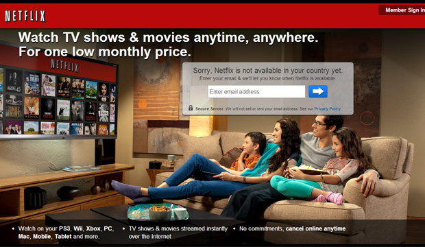
Ideally, you want to convert more visitors. So it’s natural to think that providing as many opportunities for visitors to interact with your site will improve your conversion rates. Not so. Too many options leave visitors confused. Every page element should direct the user to the same specified action or goal, and there should be one goal for every page.
Netflix is a great example of this. The entire point of the page is to get visitors to sign up for a free trial. There’s no excess information that’s unrelated to that goal and cluttering up the page.
Website design is an art form, but driving conversions involves a bit of science. It’s easy to be so focused on making a “pretty” site but to forget about the main goal of a business site i.e. driving sales is easier than that. Whether a potential customer is accessing your site by a desktop PC, tablet or on a mobile phone these five essential elements in your website can increase your conversion rates significantly.

