Effective Notification Techniques

Every Scripts & Programs are expected to have bugs some point or another. Whether it’s minor bug which doesn’t interpret the user or big one which can crash it completely because of some problem, it’s an inevitable fact of programs. And in many cases, debugging requires feeds backs from these crashes to fix it.
So what should you do….? You don’t want to end up with a bunch of angry customers and lose them. Hopefully you’d want the customers to report the bug and want them to come back to your sooner rather than later.
If this is your case, you’ll need to build an effective notification system to your programs. Below we present a list of best practices to building effective notification system help keep your customers, whether new or returning, happy. What we are about to see is guidelines for both error & other message notification on web, also other measures you need to have.
If you are know to make error free scripts, programs, also do not have any requirement to notify users then this article is not for you. Leave now ….. 😉
As mentioned above this article will contain a few guidelines to successfully get notification messages and error messages to the user. To get started we will go through a few elements that applies for both.
-
Be relevant : The biggest reason users choose not to ignore the actions you want them to do with notifications is due to lack of relevance. It is easy to create a generic automatic notification for each event, and makes automation a breeze. To continually send the same email over are methods that drive users crazy.
-
Clear the clutter : When it comes to notifications content keep it short & sweet. Think like a newspaper editor, and strive to convey information in a condensed, headline style. Display it prominently so people do find what they’re looking for and understand what to do next.
-
Engaging : Make sure to have the detailed descriptions of what you meant to convey in the short words, there are users like you and me trying to get as much details as possible in case of scenario, you may even get their help in fixing the bug.
Using these three elements you can definitely improve your systems, will get into the sections in details. Failing to comply to minimum level may lead to lot of UX problems.
Notifications
In the web, notifications are essential you have to notify user frequently, like status of operation performed, progress of operation and even more instances. To get the message conveyed its important to use the correct method, or else you may end up in getting the message late or annoying the user.
All notifications messages can be classified into these three different category.
- Temporary notification – Fades away after a few seconds.
- Permanent notification – Stays aside until user removes it.
- Alerts and Important Messages – Blocks the users & requires them to take an action to proceed.
Temporary notification
Temporary notification are used when there is no requirement to interpret the user to inform a message or expect any reponse. These notifications normally fades in & out after some time. The size of the box depends on the message content normally much smaller

GMail shows a temporary notifications when user forces for a reload, but the user still can continue what he was doing while it loads new mails if any.
Temporary notification is best suited instances where one way information is to be conveyed, these does not stop or disturb the users activity, just the message is shown in parallel.
Permanent notification
Used to display rich / Important information, where user can interact and provide reply. Its usually shown up on the screen grabbing the attention of the user and asking to complete the reply.

Google Adsense notifies users with unverified account to verify the account, but this does not effect the users but it does stay until an action is performed.
Alerts and Important Messages
Alerts, used to stop the user and get an action. These notifications normally block users completely from performing any actions without completing the notification.

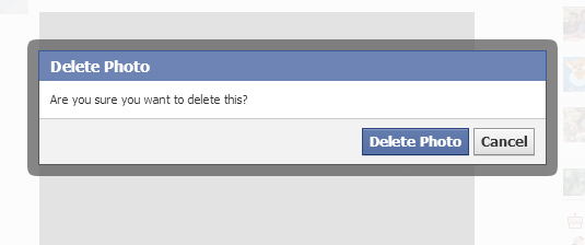
When a user choose to delete a photo on facebook, the users is blocked to confirm the same & blocked from performing any other action without making a choice.
Best suited for informing highly important messages which can lead into serious trouble if user happesn to ignore it. This is the most dangerous and very effective notification improper usage can lead to serious damage for you.
Wrapping
With UX becoming a key factor in creating/designing a product or system, it’s really necessary to keep a happy user base, to achieve it a developer / Designer need to create a good experience and a better interactivity. So, a good UX will always make users happy and businesses more successful.
Notification messages are an important part of the user experience and not one to be omitted. A notification alert message should appear every time the user perform important tasks. A perfect choice along with these can definitely bring sweets to you and fellow developers.


