The Elements of a Landing Page
Image credit:National Geographic Россия
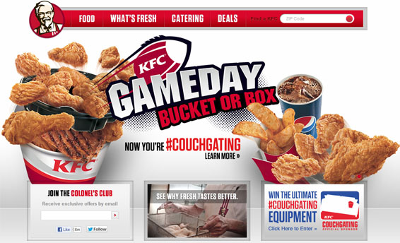
Landing Page is the main or first page of a web site, it’s where 80% of the users land on a ecommerce website and other sites. The duties of a Landing page include answering visitor’s inquiries about a company and its products & services (In-fact it’s the main duty ), directing user to their destinations. Landing page performs almost similar to a Receptionist.
Landing page and Home page need not mean the same on the internet. Home page mean few other things too. Before we go into them lets look what else they mean.
- Web Site Landing Page.
- Web Browser Home Page – The Web site the browser loads automatically when it’s opened or when the users uses Home button of a browser.
- It can be the index file in a directory that loads automatically when a directory is accessed.
In this article we will be using Landing Pages all it means is the first page / Index page of a website. Landing Page being the first contact a user makes at a Website, Convincing visitors to take some kind of action is an important task for a landing page.
Introduce Yourself..!
Start the page with company name and/or logo in a reasonable size and noticeable location followed by the tagline that summarizes about the website, unless you are not famous personality or a Brand.Even well-known companies do have a tag line to inform first-time visitors about the site’s purpose. It is important to have a good tagline.

Vimeo displays the logo at the top left cornet followed by the tagline “Your Video Belongs Here” in font size.
Make sure its more prominent than the items around it so it gets first attention when users enter the site.
Represent with Images
Display images that representing you or your business depending on your website, if you sell cakes the front page should have pictures of cakes. Avoid using spins or other effects to it. Think twice before adding effects that can be irritating the users.
Emphasize the Top High-Priority Tasks
Your homepage should offer users a clear view about the services that you offer, make sure to display the key tasks and link it to task pages.
One of the most important design decisions for any homepage is determining what content homepage coverage. It depends on the company’s business goals. You need to use your Analytic to measure stuffs.
Design

Image Source: michaeljosh
When it comes it to Design make sure you have a slightly different visual design for home page, which stands out from other pages. Use template that matches your company, especially the color (colour).
Label sections and categories according to the value they hold for the customer, not to the company.
Uppercase letters are not as easy to read as mixed case words, and they can make the page look busy and loud. Avoid using spaces and punctuation inappropriately, in order to catch user attention.
First impressions are key. Although good design alone will not keep someone for long, at the very least grab their attention to take a look around.
Contact Page
It is the most important page for a business web site, this is where the first contact is made with your client. As First Impression can get you to a Good Start will solve half the process, it’s necessary to make a contact page that can do it.
Ideally you’ll want to give more than one method of contact. At the least an email address and contact form. To make you more “real” though you should try to include a phone number as well. The information to be made available depends on the type of business. Like a company that does online services like SEO (Search Engine Optimization) need not provide the physical address to the public as a company that sell a physical product need to.
Primary Navigation
If they are unable to navigate your website effectively or if the site structure is confusing , they will simply give up and leave.
The Key Elements include the logo (a link to the index page), as well as links to the main sections of your site like services, about and Contact.
Footer Navigation
Footer navigation menu is as important as the main navigation menu, it’s especially important to offer a duplicate set of navigation links in your footer. You want to make it as easy as possible for people to find the content they are looking for on your site.
Social Links
Image Source : Sean MacEntee’s
In today’s social world. People like to share things and get updated on social media. Make it easy for people to do this. Don’t forget to add social buttons to your posts, you can hide the counts if you don’t have a decent figure.
Advertising
Avoid using Ads on Company website, it’s never a part of the website. It creates a bad impression on your company, the cost of lost customers might quickly outweigh the benefits of advertising revenue.It shows how considered you are on the website especially.
Users have grown savvier about ads on websites. They have learned to ignore ads, even if not mentioned. If you run an unofficial website you can go ahead with it, label them as advertising so that users don’t confuse them with your site’s content.
Never place ads next to high-priority items; it will cause such items to be ignored. Avoid placing any important items above an ad.
If you use third party network for advertising make sure to use quality network like Buy Sell ads, Influads….
The homepage is the most important page on most websites , and gets more page views than any other page. Of course, users don’t always enter a website from the homepage, but it is the face of the website to the world. Improving your homepage can significantly bring in more sales and convert first-time user to active and engaged fans.


